A map can only ever reveal what the data exhibits, but a great map can really make the message clear and unequivocal. My map of the week is from an article in the Washington Post where Zach Levitt and Dan Keating posit the relationship between Covid-19 vaccination rates and hospitalization among the US population.

The map almost needs no accompanying article because it carries the message so well, but in case there’s any doubt the opening salvo of the article doubles down:
“The delta covid wave carves a dividing line across the country defined by one rule: Regions with more vaccinations have fewer hospitalizations.“
The use of a bivariate choropleth map suits the messaging perfectly by encoding both variables at once on the same map. The share of population fully vaccinated is displayed in muted light grey to bright green (less to more), and the number of Covid-19 patients per 100 hospital beds in the same light grey to bright purple. Combining each 4 class scheme produces a grid of 16 mixed colours but because of the way in which they’ve designed the colour palettes the eye is drawn to the bright end points of green and purple which show high vaccination rates and low hospitalization rates, and conversely, low vaccination rates and high hospitalization rates.
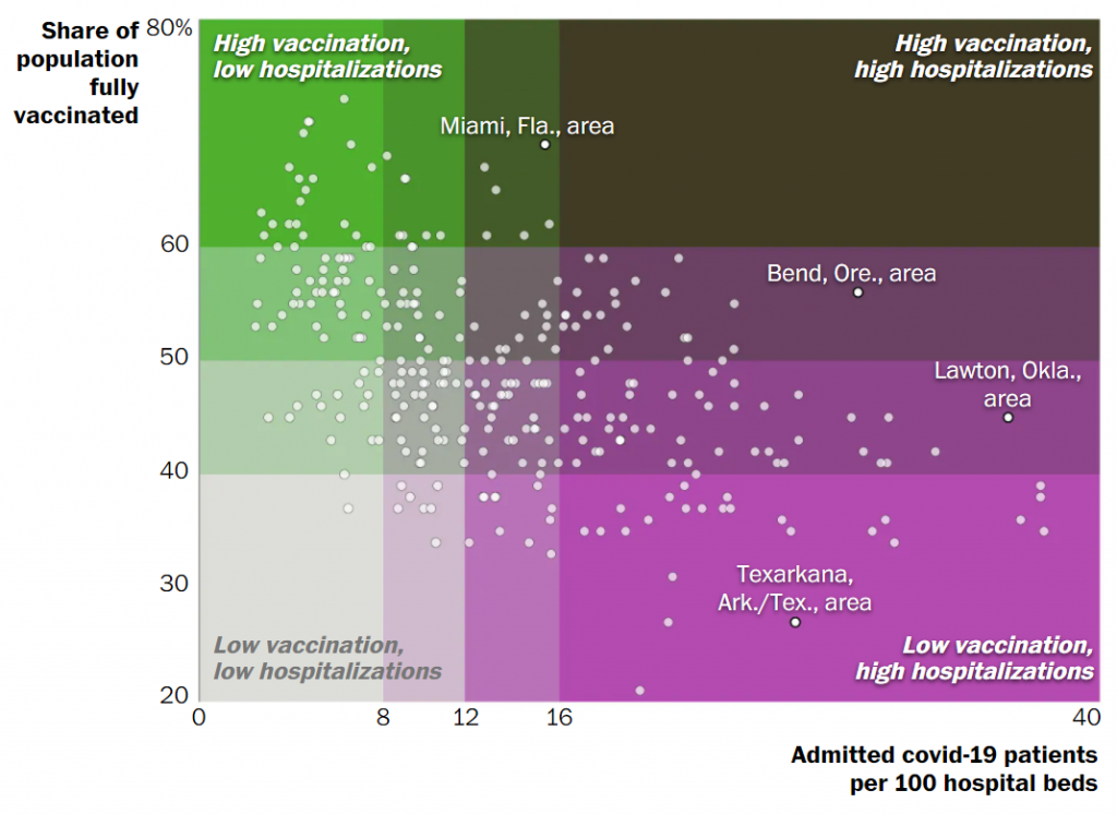
These bright areas on the map tell you all you need to know. There’s an inverse relationship. Just to prove the point further they added a scatterplot to the article, because a map isn’t always the best vehicle to get the message across.

They could have used two maps side by side, but the message would have been harder to decode. They annotate the legend to ensure people can further understand what they’re seeing. The addition of a few callouts for specific places also cements the relationship between the two variables and the way in which colour encodes the pattern.
Sadly, after nearly two years, and after science has provided us with a way to help protect people the message remains: get vaccinated.