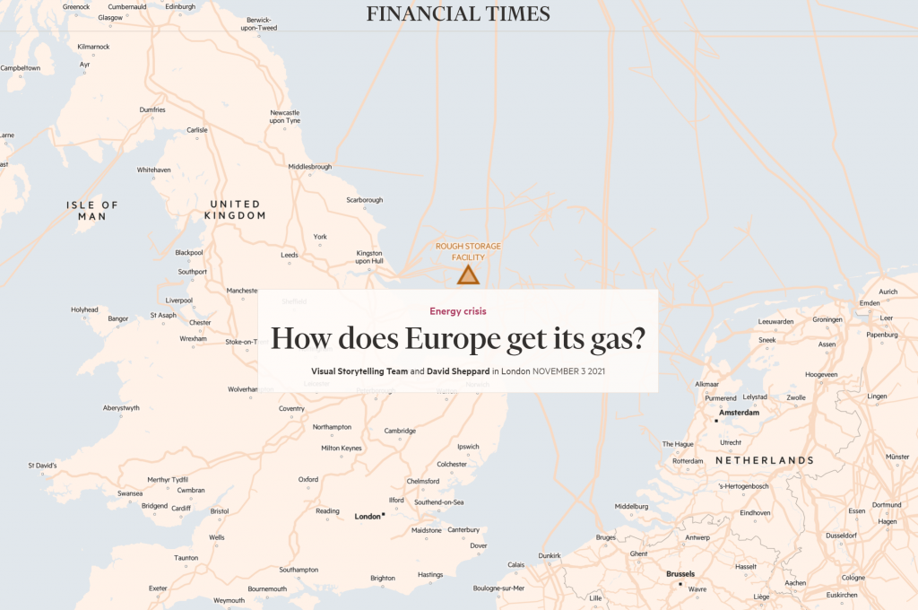
The scrollytelling form has become a standard mechanism to deliver visual journalism, but they’re not all made equally. ‘How does Europe get its gas?’ by the Financial Time Visual Storytelling Team and David Sheppard is my map of the week for showing how it should be done.
I can’t possibly do it justice on a blog with static images so I won’t even try. Head over to FT.com to check it out.

There’s nothing flashy about it, which lies at the heart of its success. The map is the star but they’ve kept the aesthetic clean, clear, unencumbered, and crucially, used a very simple (almost) monochrome colour palette. The foreground of the pipelines, gas fields, and storage facilities are easily identified across an almost non-existent basemap. There’s just enough to orient, but no more. The self-control in designing the map is evident. If it doesn’t contribute, leave it off the map. I particularly like the focus brought to each part of the story as you scroll, and the map pans, zooms, and uses transparency to mute whatever isn’t useful at that point.
Just really nice work.