It used to be the case that football teams had a home kit, and an away kit. They usually had block colours, possibly stripes, and maybe even a collar. The away kit was used simply when there was a clash with the colours worn by the home team. Kits would change every few years with a few design tweaks, or maybe a different manufacturer. Not any more. Replica kits are big business, and kits change every year. Many teams even have a third kit to extract even more cash from supporter’s wallets.
And as the proliferation of kits has grown, along with textile and printing technologies so has the innovation in designs particularly with away and third kits. And some clubs have experimented with maps. Yes. maps.
Football fandom is nothing if not based around the notion of your club being the epicentre of your world. It defines rivalries from national teams down to local levels. Where football is concerned, where your club exists is important. And what better way to express that idea than with a map, placed on the shirt itself for fans to proudly show how important their club, from their town or city is to them (unless you’re a Man Utd fan obviously, but I digress).
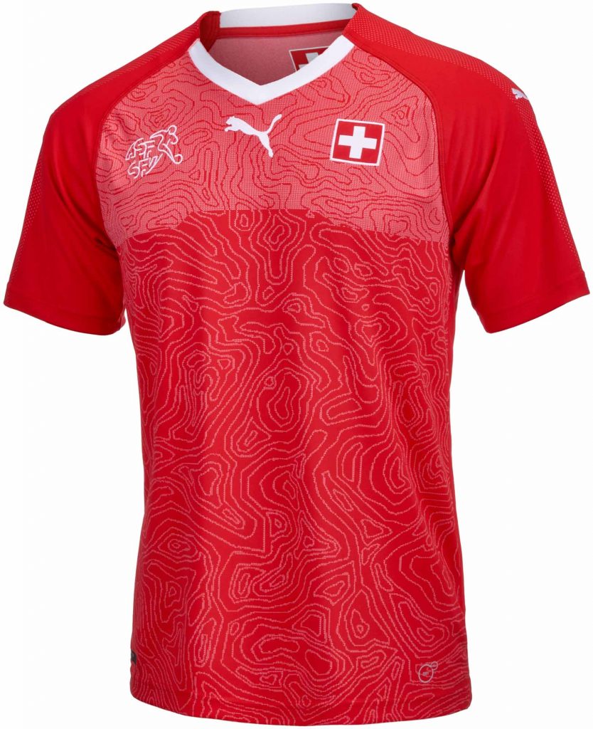
I’ve no idea who started the trend but in 2017 Switzerland released this beautiful shirt by Puma with a focus on Swiss topography. It’s the first I can recall. The difficulty with maps, or at least abstract maps though, is some thought it resembled scrambled brain, rather than echoing the majesty of the Swiss mountains mapped with contours.
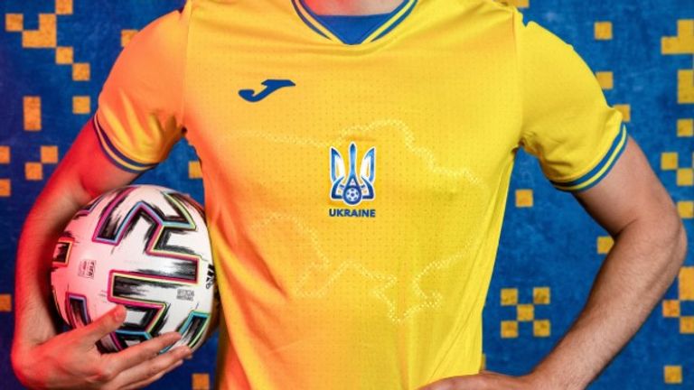
For the 2020 European Championships (held in 2021 due to the pandemic) Ukraine had an outline of their country on the shirt in a semi-reflective print so at certain angles it shone from the underlying yellow. Now, as most will know maps are often used for political purposes and while this isn’t the place to get into a discussion about geopolitics let’s just say the Ukrainian Football Association was not popular for including the Crimean Peninsula, annexed by the Russian Federation in 2014. Nice shirt though.
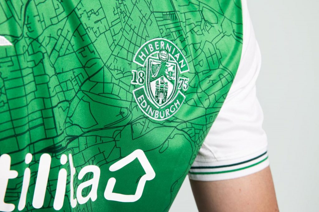
In Scottish football, the 2021/22 Hibernian shirt also carries a map, based on the OSM street network by the looks of it. I presume there’s a copyright byline “© OpenStreetMap contributors” sewn into the shirt somewhere. The badge is positioned above Leith, locating the club within the wider Edinburgh area. Both the Ukraine shirt and Hibs shirt are made by Joma so there’s clearly a map geek in their design team somewhere.
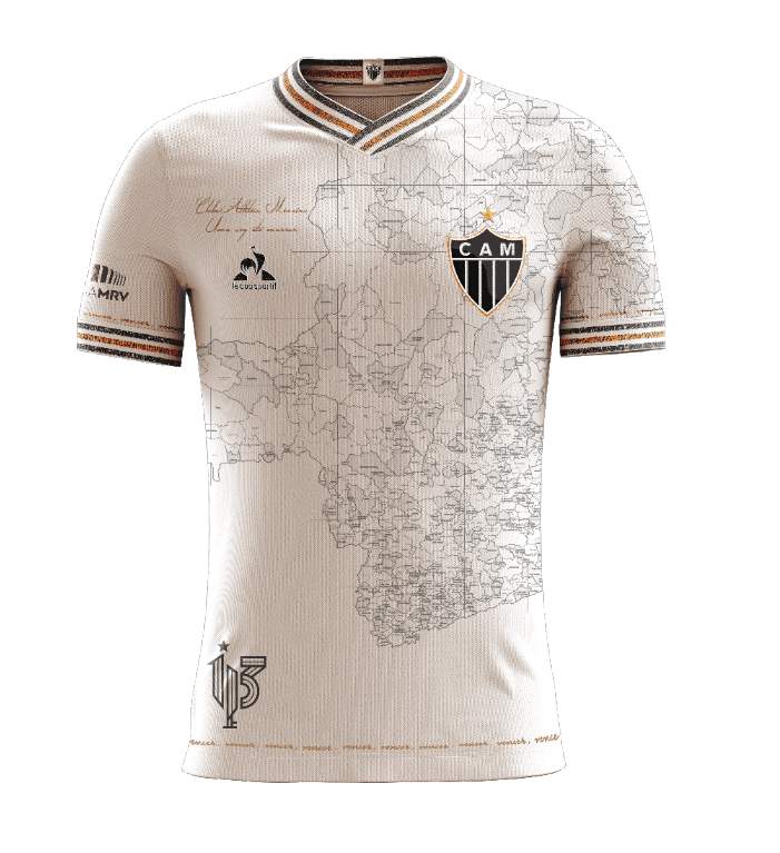
And what about this from Brazilian club Atlético Mineiro: their 113th anniversary ‘Manto Da Massa’ shirt. I believe it is the result of a competition, and this winning design was by supporter Lucas Adriano which features a detailed printed map of Minas Gerais on the front. Possibly one of the most beautiful football shirts ever made. I’m a fan already.
And finally, I’ve been campaigning for my own team, Nottingham Forest to make a kit with a map in the design for a few years. Forest’s City Ground is one of football’s most iconic locations on the bank of the River Trent. The river itself forms part of the club’s badge (itself routinely regarded as one of the best club badges). But why not make the river a feature across the shirt? I’ve therefore created this design with a muted street network that embeds and emboldens the River Trent in white. The club badge is situated in the bend in the river where the City Ground exists, and where Trent Bridge crosses the river. My childhood home is also on the map not far from the badge itself. Classic red and white home shirt colours but no reason this couldn’t be made into an away set of colours or a third kit.
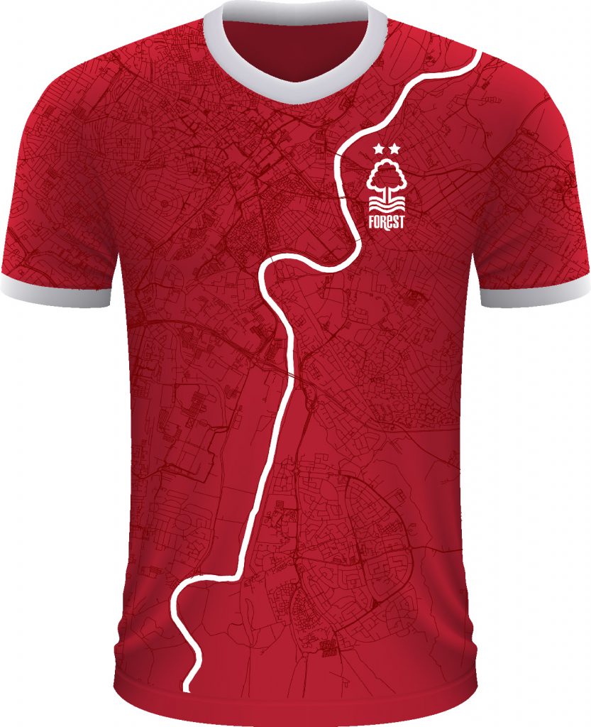
C’mon Forest, make this shirt and take my money!
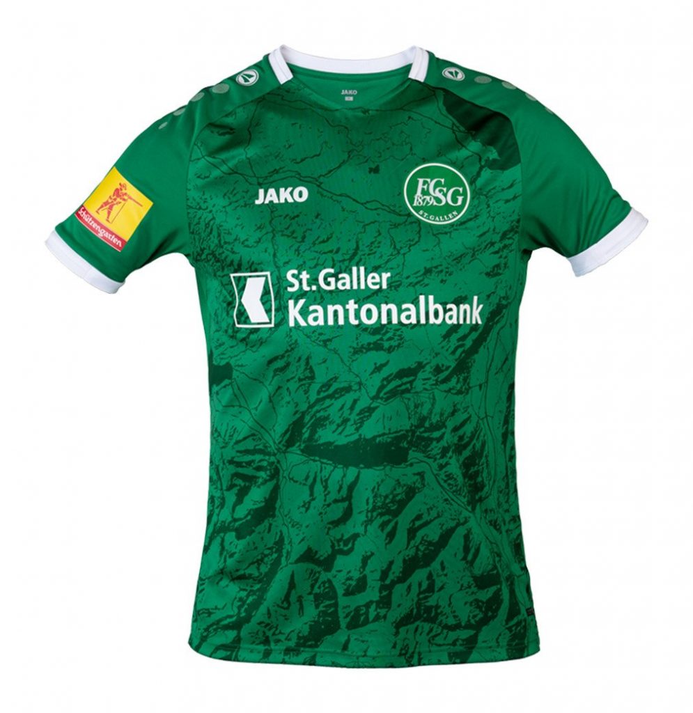
Update: Alex McDonald let me know of another 2020/21 kit with a map on it. This rather wonderful home kit by Swiss side FC St Gallen features more Swiss topography but this time depicted using a hillshade. St Gallen itself is broadly where the club badge sits. This seems to be a pattern with mappy kits! There’s also a road network and lakes with Lake Walen (Walensee) in the centre of the front of the shirt, and Lake Constance (Bodensee) towards the top right (left shoulder). Eagle-eyed folks might recognise the Walensee area as that depicted by one of Switzerland’s most celebrated cartographers Eduard Imhof in his classic Karte der Gegend um den Walensee (1938).
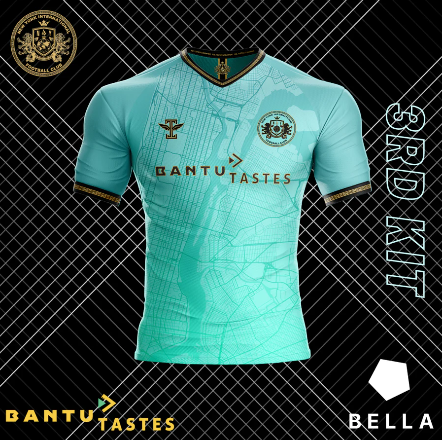
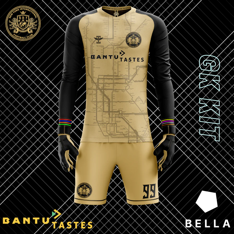
Update from New York International F.C. are their 2022/23 offerings which uses the street network on their new 3rd kit but, even better, a New York Subway map on the goalkeeper’s jersey. It’s Jake Berman’s version, rather than the official map which I guess would have been way too expensive to license.
While many of the teams who plump for a map kit use local maps that feature their home locations, Inter Milan have taken a more global approach to their 2022/23 away kit. They frame their design thus “FC Internazionale Milano is born out of rebellion, fighting the status quo. Including. Welcoming players from all over the world, and all over the world our family grows, our brothers and sisters share the same values. It doesn’t matter where they are or where they come from.” Clever marketing pitch to go for the global market by using a world map!
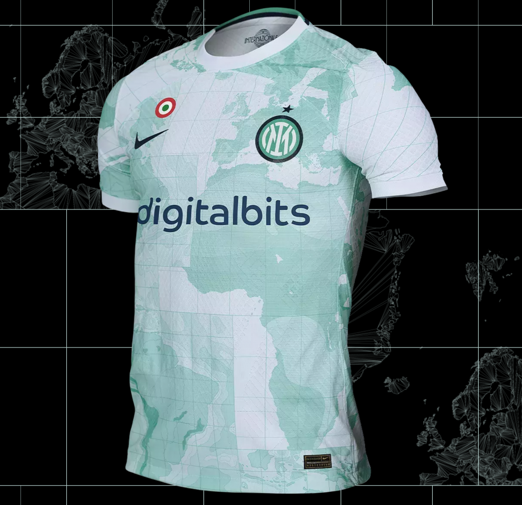
They follow the trend of ensuring the position of the badge is meaningful in placing it over Italy. There’s a strange graticule that seems to show curved meridians toward the top, but some sort of pseudo-quadtree tiled grid towards the bottom.
An addition from the 2022/23 season and a departure from football to rugby with this tube map inspired design for Harlequins who play in Twickenham, west London.
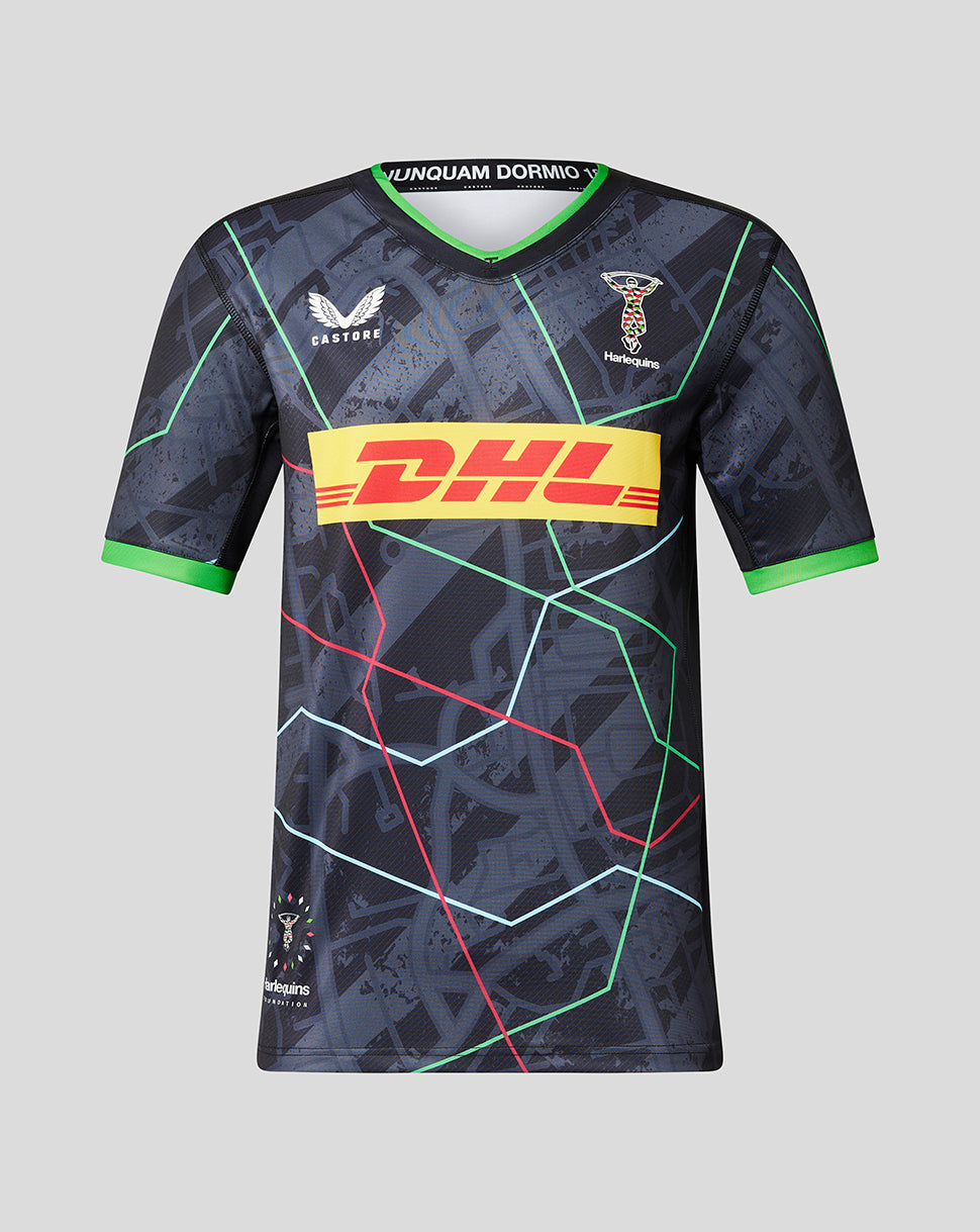
There’s a nice write-up featuring the thoughts of its designer Rob Dearden here. It’s a mashup of a schematic that mimics the iconic tube map, but in Harlequins colours placed on top of a street network showing the Twickenham area. The map is positioned so the club badge is shown where the ground, The Stoop, is located. A nice shirt that cements the relationship between club, its location, and its supporters. It’s just a pity the club’s main sponsor has such a gawdy, overbearing logo splattered across the front.
No sooner had I re-posted this blog than other contributions were sent my way.
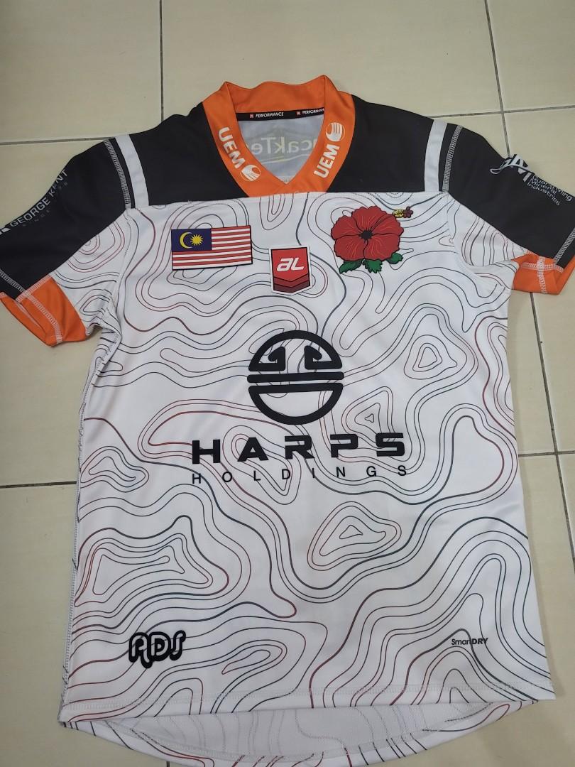
The 2021 Malaysia rugby jersey has the contours of the Crocker mountains in them. Thanks dumb genius/smart idiot.
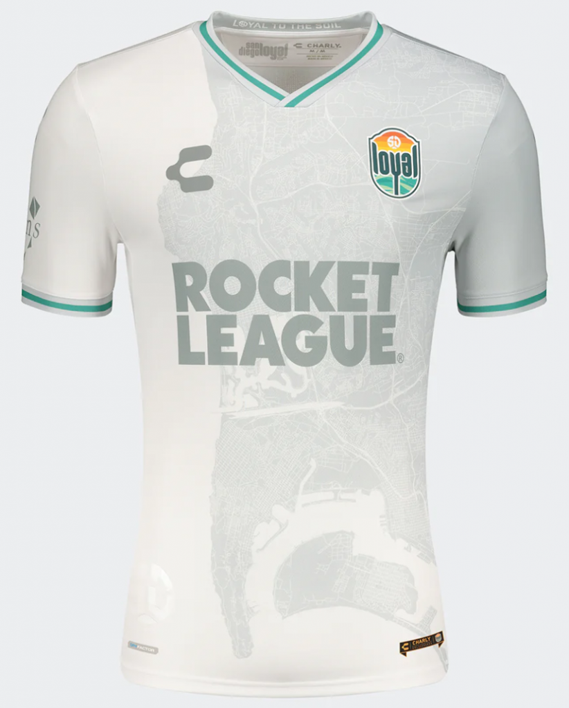
The San Diego Loyal Soccer team (agh!, it’s FOOTball) features a map of the area on their 2022 shirts. Again topographic contours on the home shirt, but more of an actual map, possibly imagery, subtley printed on the white away shirt. Thanks Colin Lawrence.
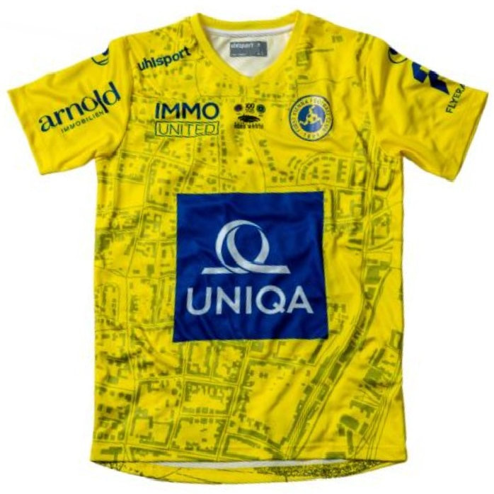
First Vienna FC had a nice street network with building footprints on their 2021/22 shirt. Again, the cub badge locates the ground. Thanks Luke.
Anyone know of any more mappy football kits?
The Chicago Red Stars primary kit is based on the elevated train “the L” that runs through the city: https://shopredstars.com/collections/jerseys/products/womens-elevated-jersey
Loved the old Sporting KC shirt that mimicked the Kansas-Missouri border with the badge sitting right on where Kansas City straddles the border. Genius! https://images.mlssoccer.com/image/private/t_keep-aspect-ratio-e-desktop/f_auto/mls-skc-prd/eakrhbf4w11ayvyzau6y.jpg
Love these map related football shirts, combining two of my great loves. Forest should take up your design!
There’s also these:
Tottenham: https://scorum.com/en-us/football/@agodux/tottenham-with-the-north-london-map-on-the-third-jerseys
Galway: https://galwayunitedfc.ie/product/adults-gold-galway-united-training-top/
Schalke: https://www.umbro.com/en/football/club-kits/fc-schalke-04-20-21-away-kit/
Himmarshee: https://twitter.com/himmarsheefc/status/1123351627807772672