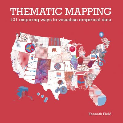
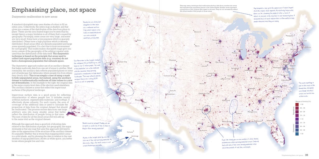
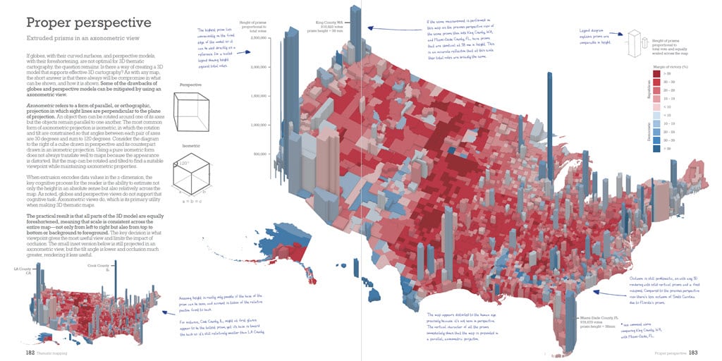
Sometime after my first book was published in 2018 I began to think I had another one in me. Thematic Mapping: 101 inspiring ways to visualise empirical data was published this week by Esri Press. Written mostly in 2019 and during the early part of working at home as a result of the coronavirus pandemic, it’s a book that explores the rich breadth and depth of thematic mapping techniques. It takes one dataset, the 2016 US presidential election, and maps it in 101 (plus a few more) different ways, each of which presents a new shade of the results.

Many more maps are made by people who have little cartographic training than by those who have a background in cartography. Visual journalism has blossomed over the last decade. The technology we have at our disposal means the entry point to making a map of an interesting dataset keeps getting lowered. This is all great news for thematic maps, and we see them everywhere. But having a source text that organizes ideas and concepts in a fresh way also has never been more necessary. That is how I see the value, and contribution of this new book.

The nine chapters in this book focus on the portrayals that apply to the same data but displayed using different feature types, such as areas, points, and lines, as well as the distorted shapes of cartograms, 3D approaches, and chartmaps. It explores the display of empirical data through illustrations and attempts to do so comprehensively, with as few words as possible. The intent is not to set out detailed layout, design, and production content because most will be working in an environment of specifications and that largely is dictated. And tastes differ. In fact, I decided early on that each spread, and map, would have hand-written annotations, and callouts, scribbled in the margins. The intent is to add comments that explain specific aspects of the map at hand as if a reader had marked up the map themselves. It’s akin to an editorial mark-up that shines a light on parts, and the consequences of the design that may go unseen. Helping people to see the unseen helps people gain a better understanding.

The book riffs off the tagline of ‘This is my truth, tell me yours.’ because what lies at its heart is the simple notion that the same data can be portrayed in many different ways which will shape a reader’s impression of the message. The quote, by British politician Aneurin Bevan in the mid-1900s simply means ‘this is my viewpoint, but let me listen to yours’, and this seems an important framework not only for how we make maps, but also in how we consume them in relation to our own beliefs and search for the truth in what we see. Maps are made along a spectrum of truth. Even very well-dressed maps can be awful liars. Some will speak to your truth, some may challenge preconceptions. Being open-minded and questioning, with some understanding of how the map techniques plays a part in the message is never more important.
‘This is my truth, tell me yours’ is also an album title of one of my favourite bands, the Manic Street Preachers. Released in 1998, it’s a cracking album and there’s a nice serendipity in that the Manic’s latest album is also released this same week as my book. It’s one of a number of Easter Eggs and references that I’ve hidden in the book just for fun. You want another one? The book was designed to be deliberately square, being 10″ by 10″ to mimic an album cover. As an aside, there’s another link between me and the Manic Street Preachers in that the lead singer James Dean Bradfield also happens to support the same, sadly in terminal decline, football team as I do.

Anyway, I digress… the book was finished, written, illustrated, and fully edited by October 2019. Getting it published became a challenge as some of the events surrounding the 2020 presidential election changed the environment. While the book is not political at all, the mere fact I’d used an historical political dataset as the case study gave cause for a pause in scheduling its release. And of course, there are many more stakeholders in the life of a book than simply the author. Plenty of other books, albums, tours, and other endeavors were put on hold in 2020 and 2021 and my book was no exception. But it’s finally out as an eBook and available at all those online stores you but online books at.
In the first few days it’s gained a lot of wonderful reaction which I am deeply grateful for. Perhaps the one that I particularly enjoyed was by my friend Ben Hennig who called it a ma(p)sterpiece. I am aware of a considerable number of people who are requesting a print edition. It was designed for print, and I, too, am keen to see a print edition. It’s not my call, but I am hoping it will eventually be offered as a physical printed book, and I’m doing what I can to bring that to fruition.
In the meantime, it’s been a long time coming and I’m going to call this book, and the maps therein my ‘maps of the week’, and head off to give the Manic’s new album a listen.
Congratulations on your book Dr Field! I will spread the word far and wide.
It will rank up there with another of my favorite albums, “Who’s Next” from 1971.
–Joseph Kerski