It’s been one year since the invasion of Ukraine. in the early months I explored various ways of representing the displacement of refugees and invading forces through maps. The maps I made featured in a talk I gave at the 2022 British Cartographic Society conference entitled ‘Dogs, disease, and displacement’ The Ukraine maps feature from about 14:30 in the recorded video. On the anniversary of the invasion this week, how are maps being used to reflect on the conflict. Here’s just a few that piqued my interest.
The Washington Post have created a quite wonderful scrollytelling piece on the 600-mile front line between Ukrainian and Russian forces. Here’s a static extract but head to the story itself to view and interact with the original.
They feature maps showing historic territorial shifts, split them up into segments, provide detailed insets of urban areas, and all while the bright red frontline animates as the reader scrolls. The map is heavily annotated to tell the story but what will go quite unnoticed by many is the lush basemap design. The colour palettes, fonts, use of shading, subtle land use depiction, and vignettes is next level. A tour de force of this style of media reporting where the map is the main actor.
If you’re not already aware of the cartographic prowess and standards of excellence displayed by those at Zeit Online then make it a mission to regularly check out their work. Their reflection on A year of war in Ukraine is simply terrific. Again, they’ve employed a scrollytelling approach but with a split screen where the map is on the left, as opposed to the use of a map as the canvas for the whole story. Again, this static image doesn’t do it justice so head to the original.
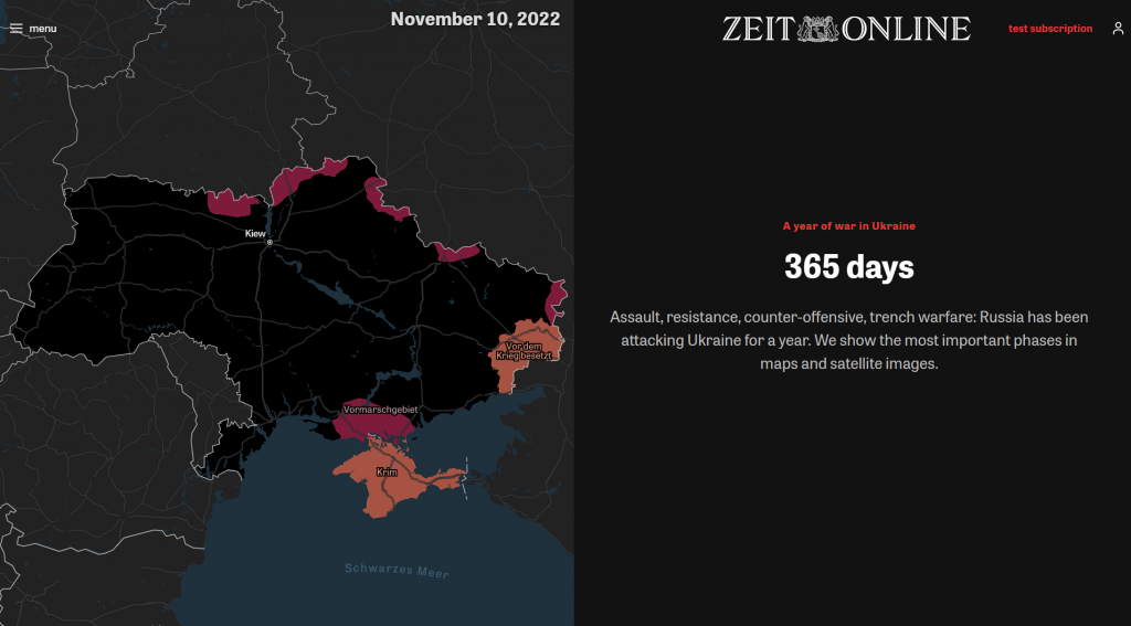
What I like about this use of the map is it shifts in focus, scale, and content to tell the story. As above, a simply territorial map, but which then automatically pans and zooms to specific areas to explore particular moments. The territorial shifts are detailed as the map updates through time. As the map zooms in, a small inset map appears with a bounding box that mimics the main map as it zooms to give a clear sense of where the larger scale map is situated. They also mix standard cartography with judicious use of satellite imagery, and other remotely sense data where necessary, mainly which the main map morphs into but also on the right as in this static display:
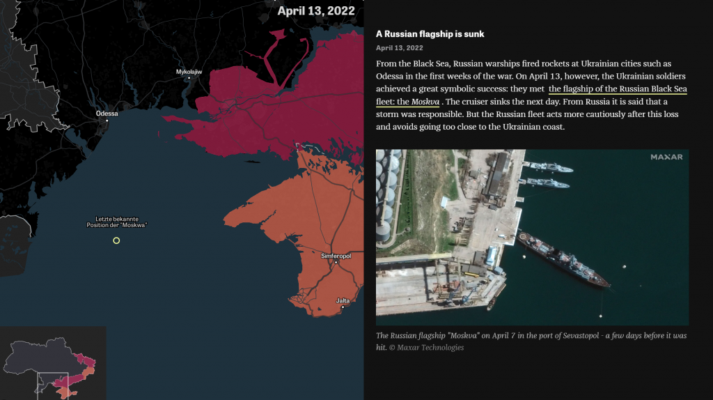
The shifts in territory move through the timeline, and the date is clearly displayed to enable readers to locate themselves temporally as well as spatially. Before and after imagery illustrates the devastation. Detailed, and impactful.
The Economist uses a novel approach in their one-year mapping showing the extent of fighting in Ukraine. Again, the article employs a scrollytelling approach as the delivery mechanism but the content comes from a somewhat unusual source. They make use of FIRMS data from NASA, developed to collect data about fires, but which also happens to capture explosions, so can be used to map conflict.

They also use SAR data from the Sentinel-1 satellite to map damaged buildings.
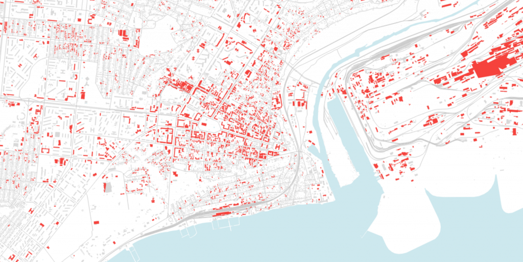
The maps vary from small to large scale with well executed and clean cartography that focuses on the overlying data. The data is modelled, but the story is as much about the use of the datasets, and what they can and cannot show to aid our understanding of the conflict, as much as it is about the conflict itself.
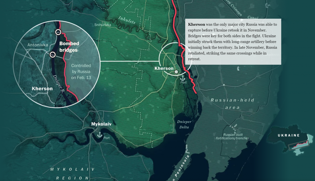
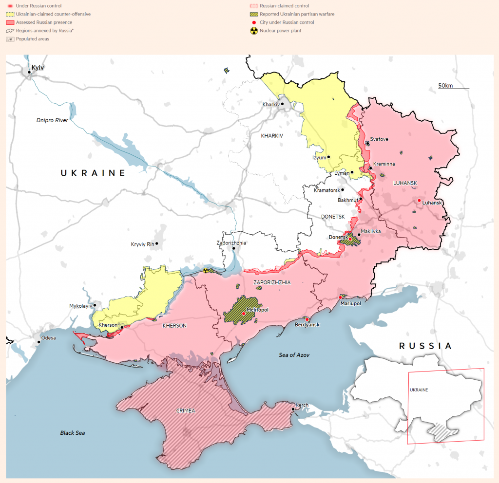
Finally in this mini review is the work of The Financial Times who have been making excellent maps of many different aspects of the conflict all year. In fact Steve Bernard, who is responsible for many of them, recently did an AMA on the work which is worth a read.
Russia’s invasion of Ukraine is monitored in daily updates and as the conflict has progressed, the cartography has matured. I particularly like the small decisions that the map exhibits. There’s no solid red, but a more subdued palette. There isn’t ‘Russian-held territory’, but instead it’s ‘Russian-claimed control’. The use of hachured symbols works well for additional context, and as an added overlay of information.
By no means comprehensive, but a small selection of some of what I think are the better pieces of map design various outlets have created to bring the news to our screens and media feeds. Hopefully by this time next year I can reflect upon maps that show how Ukraine pushed Russia back into, well, Russia!