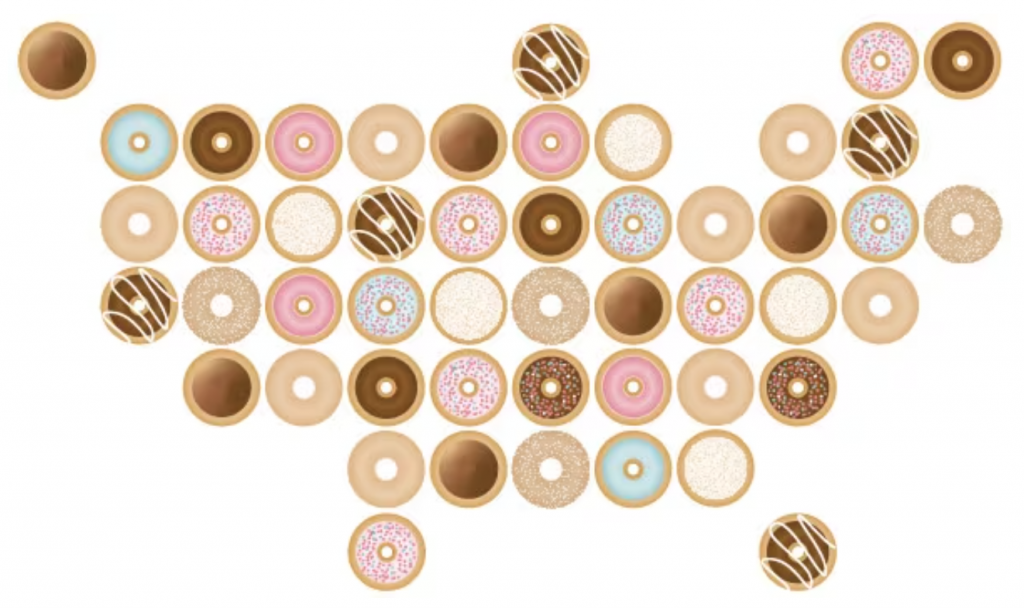
The headline map of this wonderful article by Alyssa Fowers is what caught my eye and becomes this blog’s map of the week. It’s just an illustration rather than a set of gridded doughnut charts. The article has more purposeful maps within. They are well designed maps in their own right. But who doesn’t love a doughnut? I’m off to find one!
