You may or may not be aware that my favourite map is Harry Beck’s wonderful 1933 London Underground map. And I’m in equal measure not a fan of either the modern version, or the countless ways in which the subway map genre is used and mis-used.
This often includes redesign of its style for no apparent reason – like the London Underground map in the style of Vignelli’s New York City map, or the Chicago ‘L’ in the style of Frank Lloyd Wright. I find these insanely lazy and pointless. But come up with something original and I get interested.
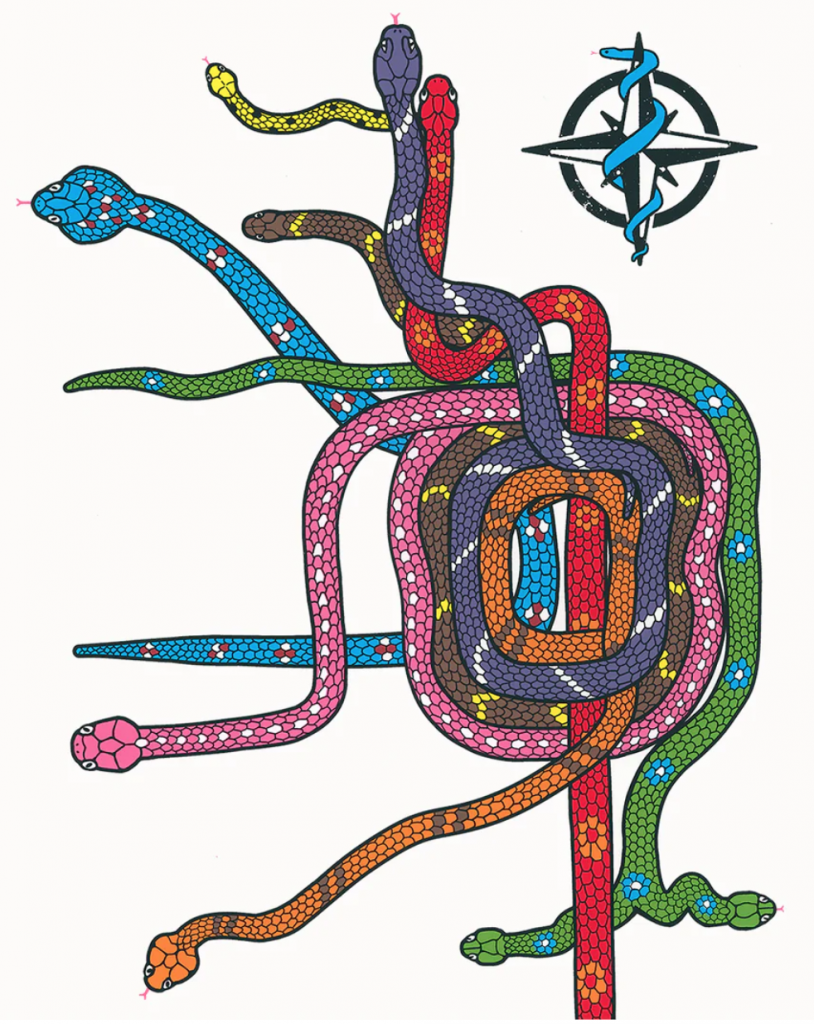
I recently saw this map by Abbas Husain of Bagman Studios. It’s a screen printed piece of art of Chicago’s ‘L’ as a nest of snakes.

I’m not at all sure if there’s any deep or meaningful reason for the use of snakes in this way but it’s colourful, and looks great. Nothing more. Nothing less. I just like it. The north point is also a fun addition, though when we’re talking schematic maps, north is all over the place of course!