Cartographers are often the scapegoat for maps that people don’t necessarily agree with. Cartographic bias can manifest in many forms and yes, sometimes the person making the map has a particular angle to draw your attention to. In times past (and possibly in some parts of the world still), maps were made under orders to show whatever a ruling government, monarchy, or junta wants there to be shown. And then there are maps that are used not only as a basis for change, but which then illustrate that change.
This week saw Texas Republicans share a map of how they intend to draw the boundaries for new congressional districts. Why is this even needed you may well ask? As reported in the New York Times here’s the current and proposed maps.
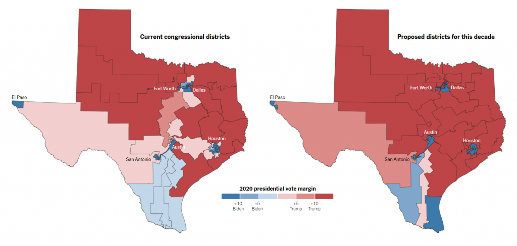
The NYT article goes into much more detail but gerrymandering is simply the process of dividing up space in a different way in order that people’s votes are counted in different catchments, and which then best serve the political motive of those redrawing the map. So here, the new map divides up space in a way that strengthens Republican districts. Marginal districts are almost completely erased from the map. It creates a situation where Democratic party gains are much less likely.
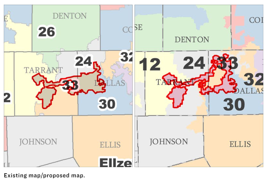
And what’s the best way of reducing the potential vote from non-Anglo voters (who will more likely vote Democrat?) Put them all in the same congressional district – which is exactly what the proposed TX-33 district is drawn to do, and in so doing making neighbouring Republican districts far less marginal. The following map was published in the Texas Monthly outlining the current and proposed boundaries for all the congressional districts. But, just look at that shape. It’s ridiculous. Except it’s not if your intent is to ensure the map is made for your political gain.
Is it legal? Yes. Is it ethical? Is it democratic? That’s for you to decide. These are my maps of the week.
Gerrymandering is nothing new of course, and I discuss its impact more in my new book Thematic Mapping. What it doesn’t do is change the location of where people actually live and vote. That only changes through people moving and registering their vote elsewhere. Politicians rely on this not happening, at least not to the extent it would substantially affect the outcome of an election.
So the distribution of voting in Texas will likely remain looking like this following 1 dot = 1 vote dasymetric map (though even this map is based on data manipulation, and not actual voter locations).
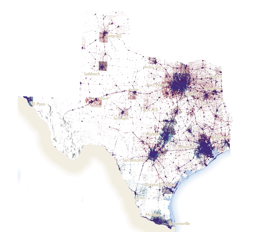
Is this a more truthful way of looking at election results? Possibly. But it’s not how the political system is currently mapped out.