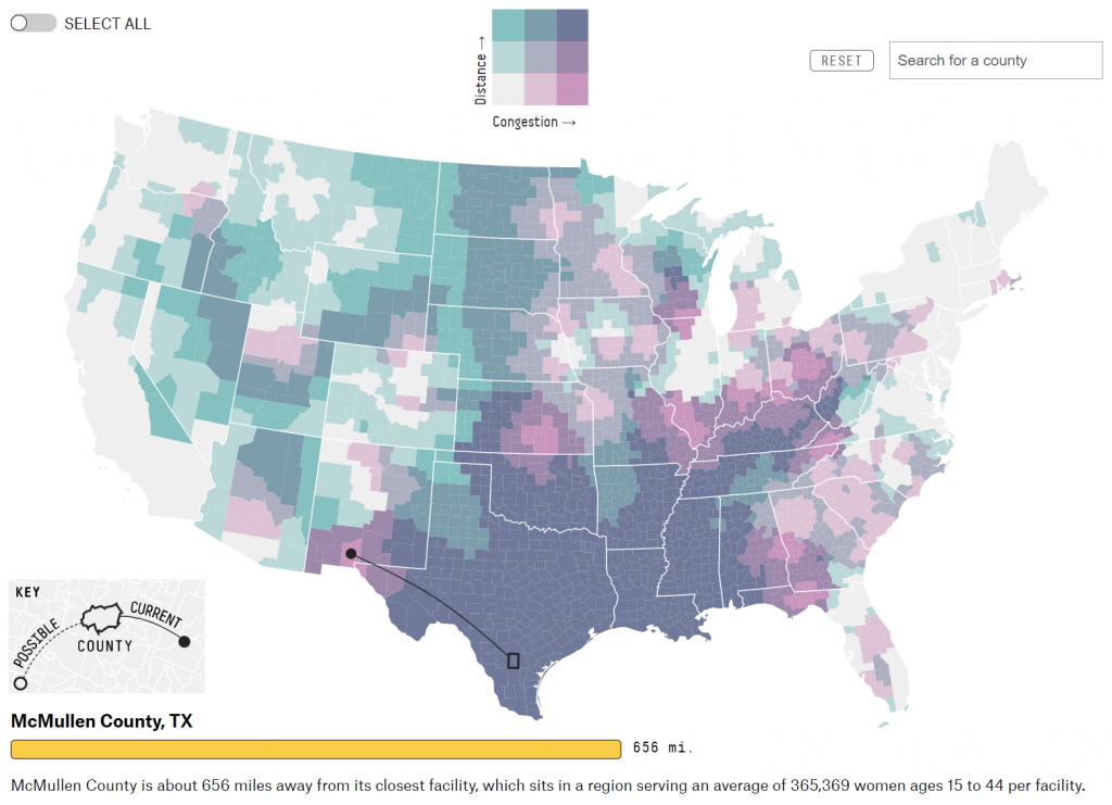
As lawmakers in US states continue to make decisions on banning abortion clinics, Five Thirty Eight have published an excellent map on the impact closures have. It uses a bivariate choropleth map, with interactive overlays. Visit the site to see the original.
First off, it’s a brave choice of map type because it’s not the simplest of maps for people to interpret because it combines two variables. But equally, why should we always assume a readership can only process basic maps? And if they’re exposed to these sort of more complex maps then maybe one outcome is that readers become more aware, and able to process them.
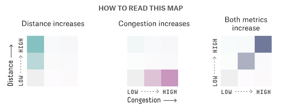
The two variables are designed to show distance to the nearest clinic on one axis, and the potential congestion (an estimate of potential women each clinic serves) on the other axis. It uses a simple three class interval so as not to introduce more than 9 colours, and a simple legend explains how to read and understand the map. This sort of helpful nudge is increasingly being seen in media maps as a way to help readers.
The interactive component comes through hovering over counties which outlines the county, and adds a leader line to the nearest facility (if it’s outside the county). That’s backed up with a filter that provides the metrics of how far it is away, and the number of potential women the clinic serves. It’s also possible to see how the map would look if further states banned abortion clinics, which introduces a second leader line showing the current situation to the potential scenario.
All in all, a really well marshalled thematic map that communicates complexity in a digestible and useful way.