This week’s map of the week is Streamflow, by the USGS Data Science for Water Resources team. You can check out the original here.
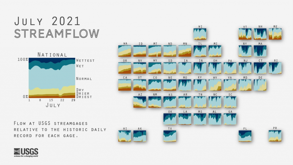
It’s a type of regular, non-contiguous cartogram. It’s also referred to as a tiled or gridded map. I like to refer to these sorts of representations as chartmaps, because it uses a map as the vehicle and organising framework for a series of small multiple charts.
The shape is broadly the US. The states are broadly well positioned but precise adjacencies are largely irrelevant anyway. But it’s the fact that it is so well produced with a good colour palette, a legend that not only provides clarity for interpreting the x- and y-axes but provides an overall summary of the national picture. There’s even a clear statement that tells the reader what they are looking at, rather than leaving it to chance.
It’s easy to see the changing flow at a state level, but also how patterns build regionally. There’s so much crammed into what at first might appear to be a simple data visualisation.
I even like the subtle (and subtlety is the trick) drop shadow on each state. In a world that all too often sees bright rainbow colours used for scientific visualisation, this is an exquisite and refreshing antidote.