Hello friends,
Here is my annual selection of favourite maps that I’ve seen this past year. They’re in no particular order, and I’ve most likely missed a load but here goes… and don’t forget to click on the links to go to the originals. I hope I’ve attributed maps correctly but if there’s any errors they’re mine and I’m happy to correct anything spotted.
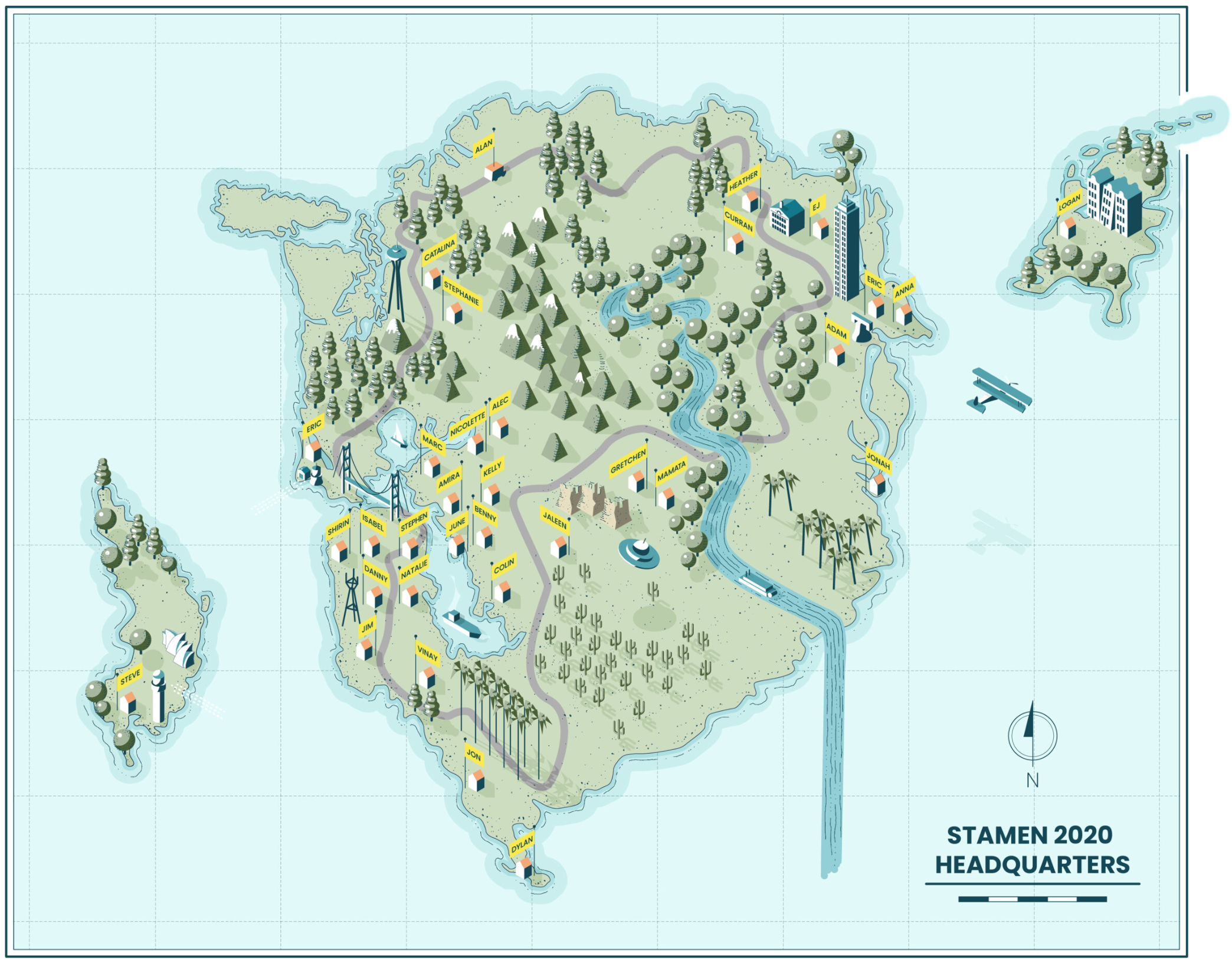
Stamen 2020 Headquarters by Catalina Plé
A lovely imagined map gifted to Stamen’s 32 employees showing their various work-at-home locations. Planimetric and 3D isometric drawing with a nod to all those classic maps that break the border. View more here.
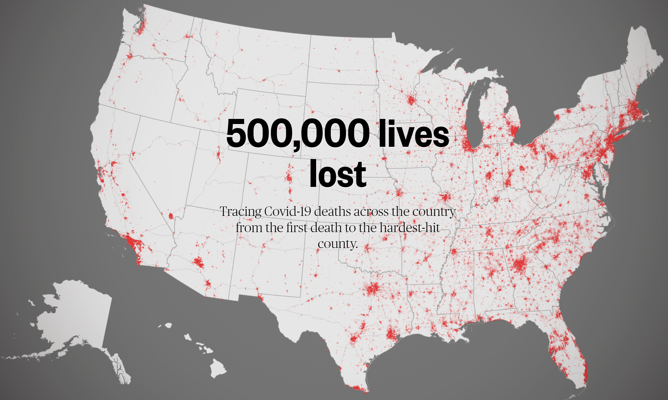
500,000 lives lost by NBC News
One of a gazillion maps of the number of deaths from COVID-19 but I like the quality of the scrollytelling in this. Explainers, and a mix of overview and detailed maps. Also – a 1 dot per death map. Why generalise if the sheer mass of dots sends the stark message? I’d usually avoid red on a map for lots of reasons, and particularly when representing deaths, but we should be scared. View more here.
Population change by US state since 2010 by Adrian Blanco and Tim Meko, The Washington Post
What? A real-life cartogram on the very front page of a proper newspaper? For that alone this map gets included. The fact it’s so well crafted is the icing on the cake. View more here.

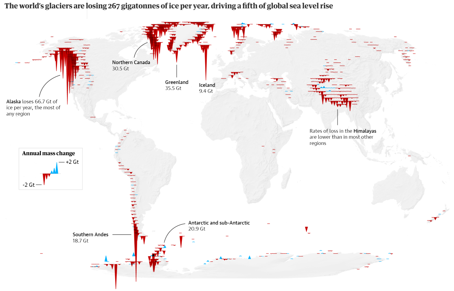
Global Glacier Loss by Niko Kommenda
A really arresting way to plot the loss of glaciers using profile plots or transects showing the quantity of ice melt (or gain, in very small areas). Again, red is useful here. We should be shocked. View more here.
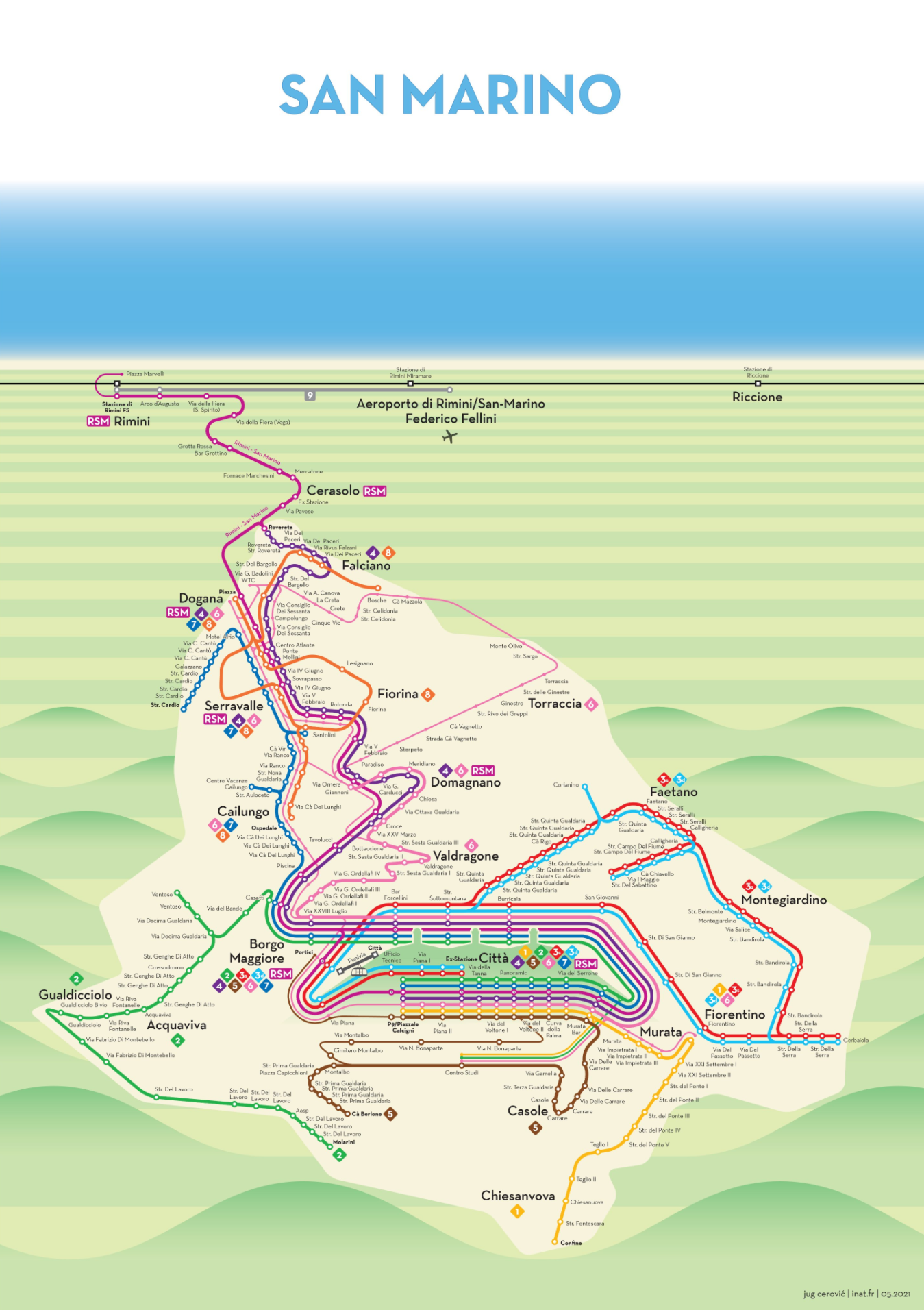
San Marino Bus Map by Jug Cerovic
Jug seems to be on a mission to re-map the world’s transit systems and every time he tackles a map his is superior. I particularly like the fact he brings a unique approach to many of his maps. Here, for instance is a planimetric schematic but laid across a landscape view with mountains in the foreground and the sea in the background, with perspective depth. All stylised, but perfectly suited, and evoking additional character and detail. View more here.
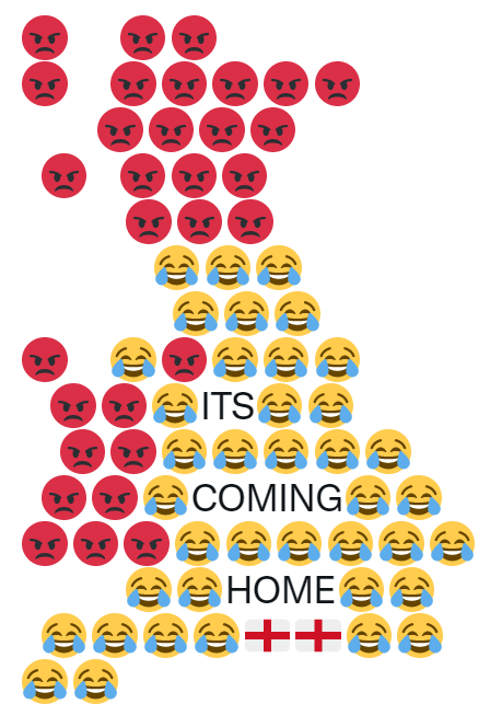
It’s Coming Home by Dan
Short on details about this map-maker but Dan used emoji to great effect to capture the mood of England during the World Cup in the summer. I guess the Italian map would look even happier. View more here
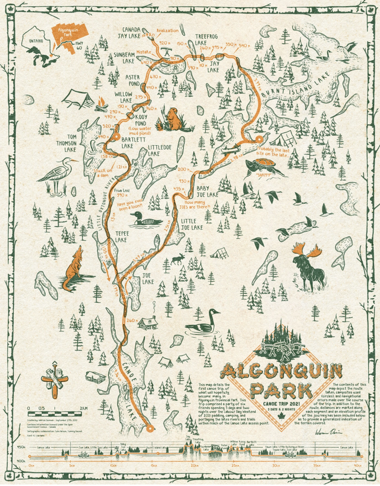
Algonquin Canoe Trip by Warren Davison
This is, quite simple, exquisite. Every detail of this beautiful map is carefully considered and illustrated. Border, inset, title block design, hand-lettering, illustrations, two-colour, the north point…THE NORTH POINT. Is there anything about this map that isn’t to like? View more here.
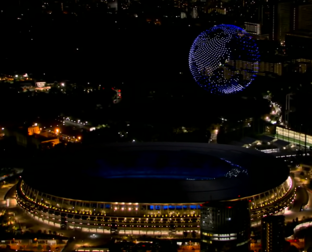
Tokyo Olympics Opening Ceremony Drone Globe
I want one. The use of all those drones to create a visually stunning display and the foresight of someone to appreciate that the globe is the best possible object you could possibly use…brilliant. A breathtaking moment. View Video here.
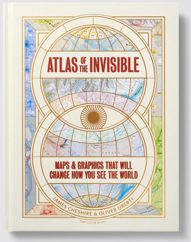
Atlas of the Invisible by James Cheshire and Oliver Uberti
They’ve done it again: the third masterpiece of cartographica-coffeetabelism (just made that up). Arguably their best book yet as James and Oliver take important datasets and fashion them into maps that deal with important issues and express them in both understandable, and graphically imaginative and effective ways. It’s already won plaudits and awards, and deservedly so. If you haven’t bought it, or received it as a Christmas present, go drop everything and buy it now. View more here (including samples of the maps).
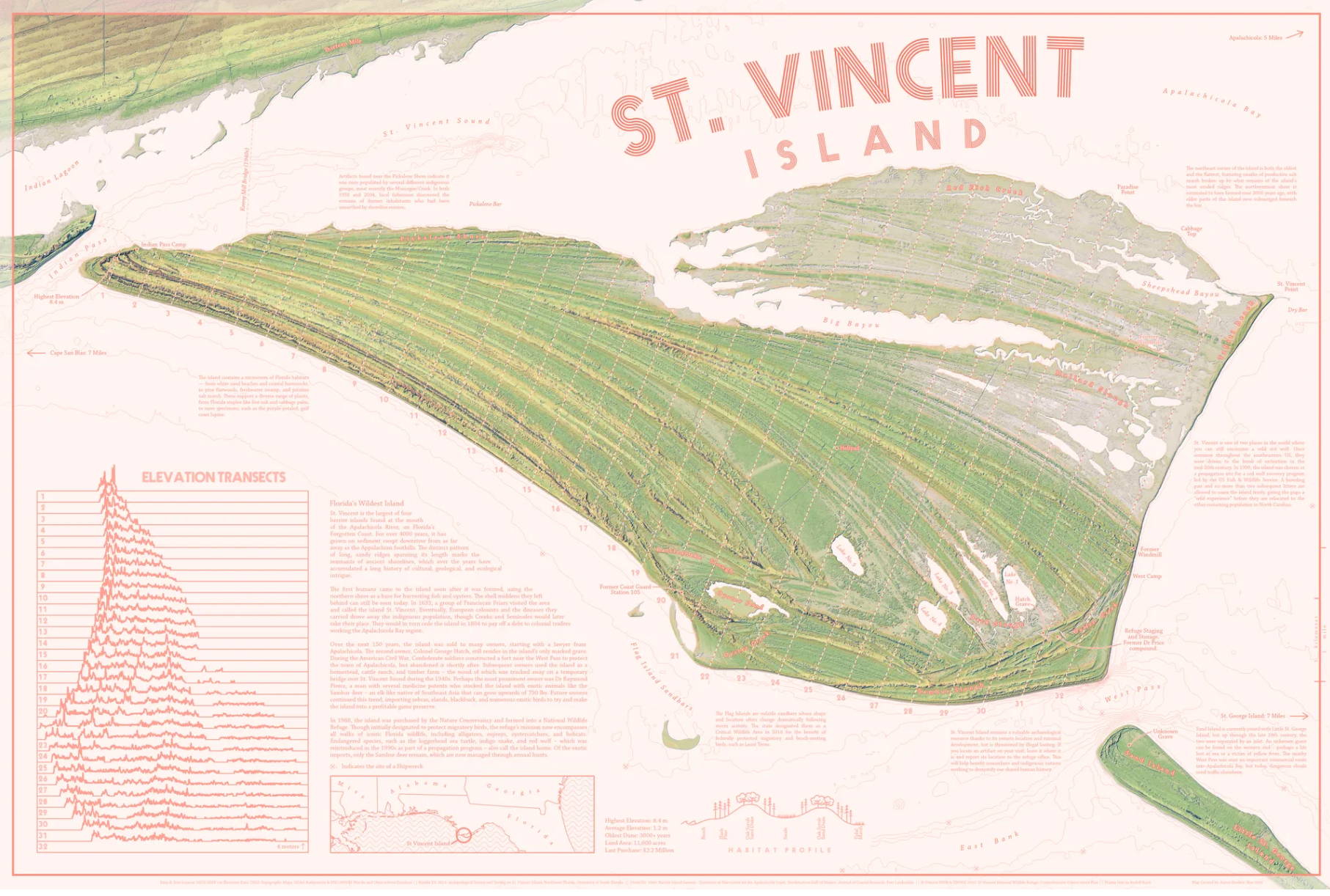
St. Vincent Island by Aaron Koelker
Such a small place, but such a rich and detailed map with a delicious colour scheme. So many really clever design decisions like the curved title text. Perhaps of most interest is the fact there’s such a small vertical range in elevation yet the map actually emphasises this otherwise almost completely flat feature. View more here.
Arctic Warming by Greg Fiske
A simple, but effective distorted globe with a single message. View more here.

The Lost Treasures of Isla del Coco by Jakob Listabarth
I find there’s something rather soothing about monochrome maps, and of course they don’t need to be greyscale. They’re also technically accomplished when well designed. View more here.

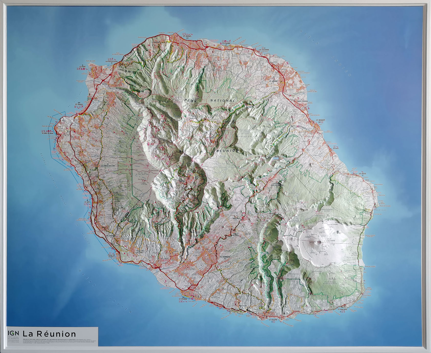
La Réunion by Institut Geographique National (IGN, France)
It doesn’t matter how much we try and fashion a 3D appearance for our 2D maps, sometimes 3D needs 3D. Here’s a stunning heat-formed map by IGN that blends superb topographic cartographic design with the technique to create a beautiful physical map.
Murky Waters by Andrew Douglas Clifford
The Spilhaus projection has made a big comeback in the last couple of years and here, it is used as an excellent choice to map areas of the seabed that haven’t been mapped. A map showing the presence of absence. View more here.

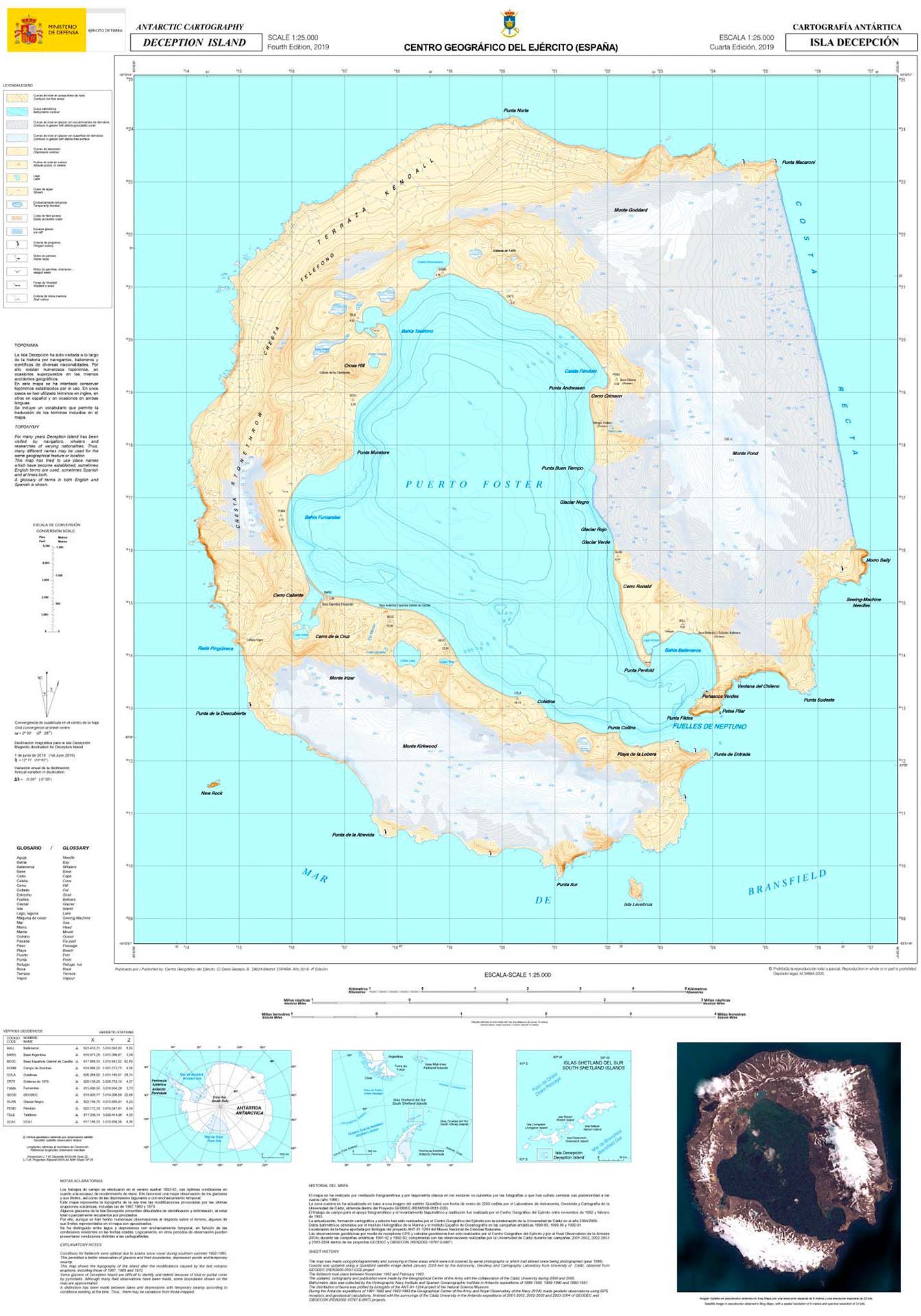
Deception Island by Centro Geográfico del Ejercito / Army Geographic Centre (CEGET, Spain)
Just a well marshalled topographic map sheet but what I like about this is there’s really not much to map on Deception Island – yet here’s a wonderfully rich and detailed map nevertheless. Because, why not? The island is home to Argentinian and Spanish research stations, as well as being a stopping point for Antarctic cruise ships.
Penguinland by Danai-Maria Kontou
A wonderful small format map (because maps don’t need to be big); a cartogram; and a lovely colour scheme to boot.

Screwed by Kenneth Field
Ordinarily I’d leave my stuff out of these sort of lists but heck, it’s my list so here’s a map I liked making. A multivariate thematic map of the 2020 Presidential election.