This fantastic infographic of the 2022 UK climate summary (compared to the previous 30 year aveerages) caught my eye by Neil Kaye.
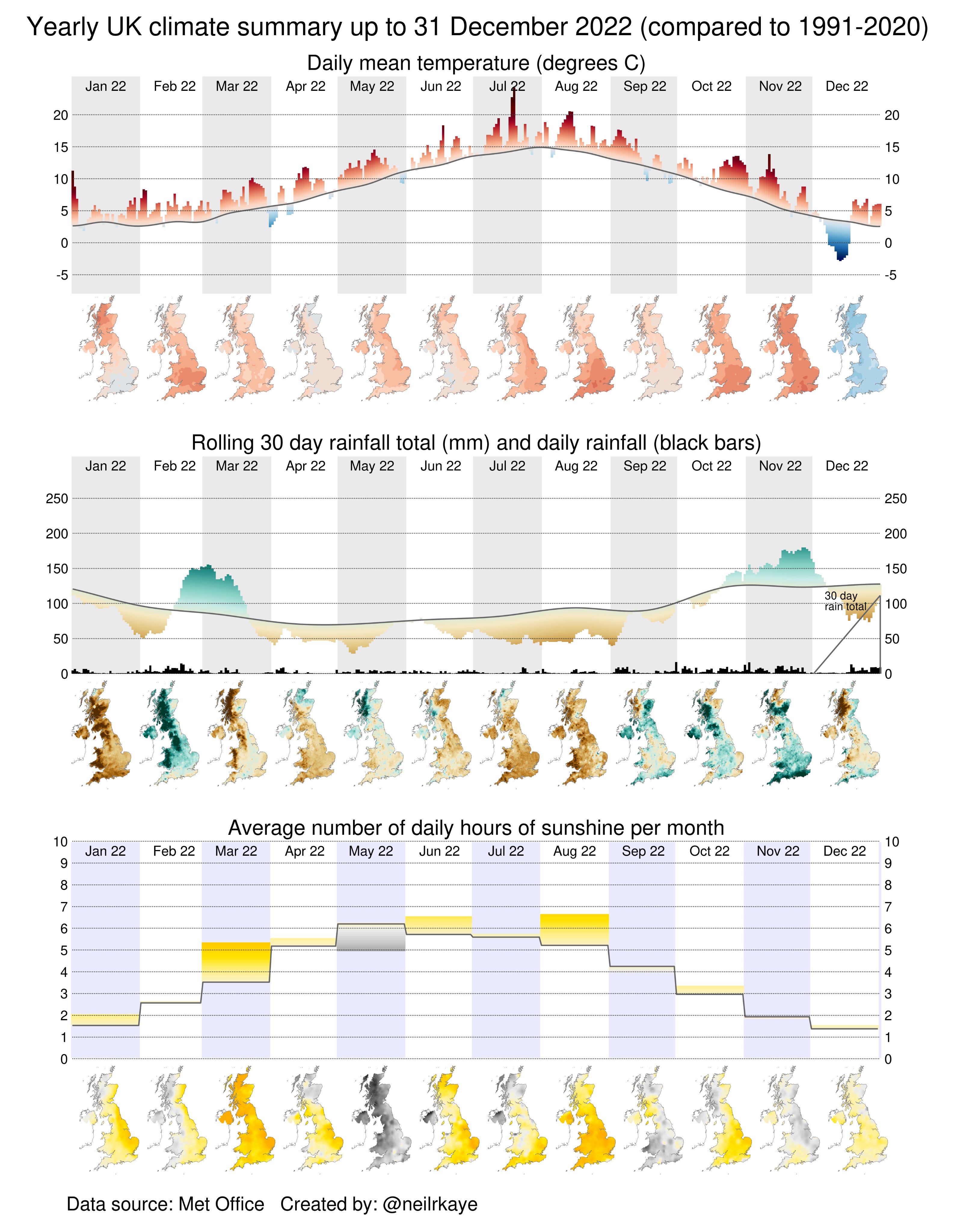
It’s essentially an example of using small multiples where each individual map is really only important in the context of the collection of maps. It’s the sequence that tells the story.
The maps are also only one part of the story because the graphs, which contain matching colour schemes to mimic the maps (and which work as mini legends), help tie the graphs to the maps and vice versa.
Three variables in three row of data enrich the story covering temperature, rainfull, and hours of sunshine. Alone, each is compelling, but presented alongside one another they cement the way in which variables are not only related, but which aggravate each other in the mix of daily weather circumstances, as well as part of the overall climate story.
The small design decisions also elevate it such as ensuring vertical axis labels appear on each side so the eye doesn’t have to track too far, or the fact the Republic of Ireland doesn’t need illustrating for this dataset so it is truncated, in preference for making each map even smaller.