Map of the week this week is the CDC COVID-19 Integrated County View which shows current transmission rates (image below screen grabbed 6th August 2021).
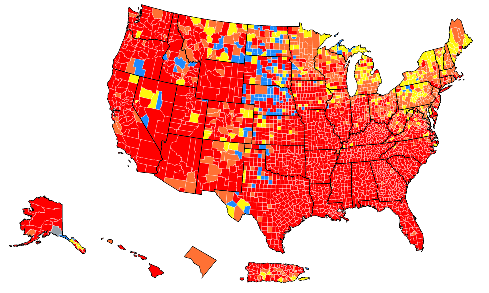
Four colours indicate high (red), substantial (orange), moderate (yellow), and low (blue). I could argue that even the high rate at 100 per 100,000 people (1%) isn’t particularly ‘high’ in absolute terms, but it is in relative terms of course. I could also argue that the colour scheme isn’t optimal, not least for anyone with different colour vision. Except I’m not going to.
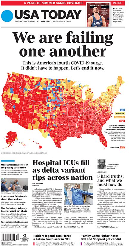
This is a striking map to ram home an important public health message and screaming bright red is useful as a shock tactic. This pandemic isn’t over, and as vaccination rates seem to have stalled somewhat, we’re still very capable of ensuring the virus moves among us. This map even made it to the front page of USA Today – THE FRONT PAGE ABOVE THE FOLD – with a headline borne of frustration, and hopeful persuasion.