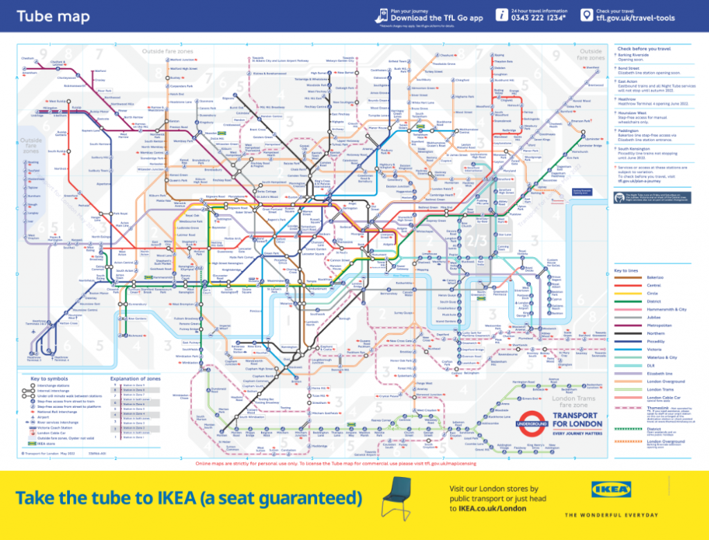
May 2022, some 90 years since Henry ‘Harry’ Beck designed his famous ‘Map of London’s Underground Railways’, and the latest incarnation has been released here. It’s now called the ‘Tube Map’ except it’s anything but a map of the tube network.
I’m a huge fan of Beck’s original design. Borrowing heavily from other transport maps of the period (e.g. by George Dow), Beck designed a wonderful schematic diagram of the 8 London underground lines and 212 stations. It was an aesthetically pleasing solution based on some basic, and consistently applied design principles. It was topological, reductive, eschewed above-ground detail (other than the river), and used a minimalist symbol vocabulary with bright colours to distinguish different lines.
Of the new map, according to Jon Hunter, Head Designer at Transport for London “The [new] map isn’t complicated. There is a huge amount of information there. What would Beck have done? It would probably look like what we have done today.”
I respectfully beg to differ. I imagine Beck turning in his grave in East Finchley Cemetery as the nearby Northern Line trains rumble past. His careful design was specific to the design problem he faced with the network at that time. I, and many other cartographers and transit map experts, believe that Beck would have been likely to approach designing for the current requirements differently. We’ll never know, but the various books, biographies, and details we do know of Mr Beck and his map reveal a very singularly minded individual with strong opinions on what worked, and what didn’t when it came to the design of that specific map. Certainly, some of his comments of iterations during his lifetime were heavily critical of how subsequent designers made changes and additions as the network grew.
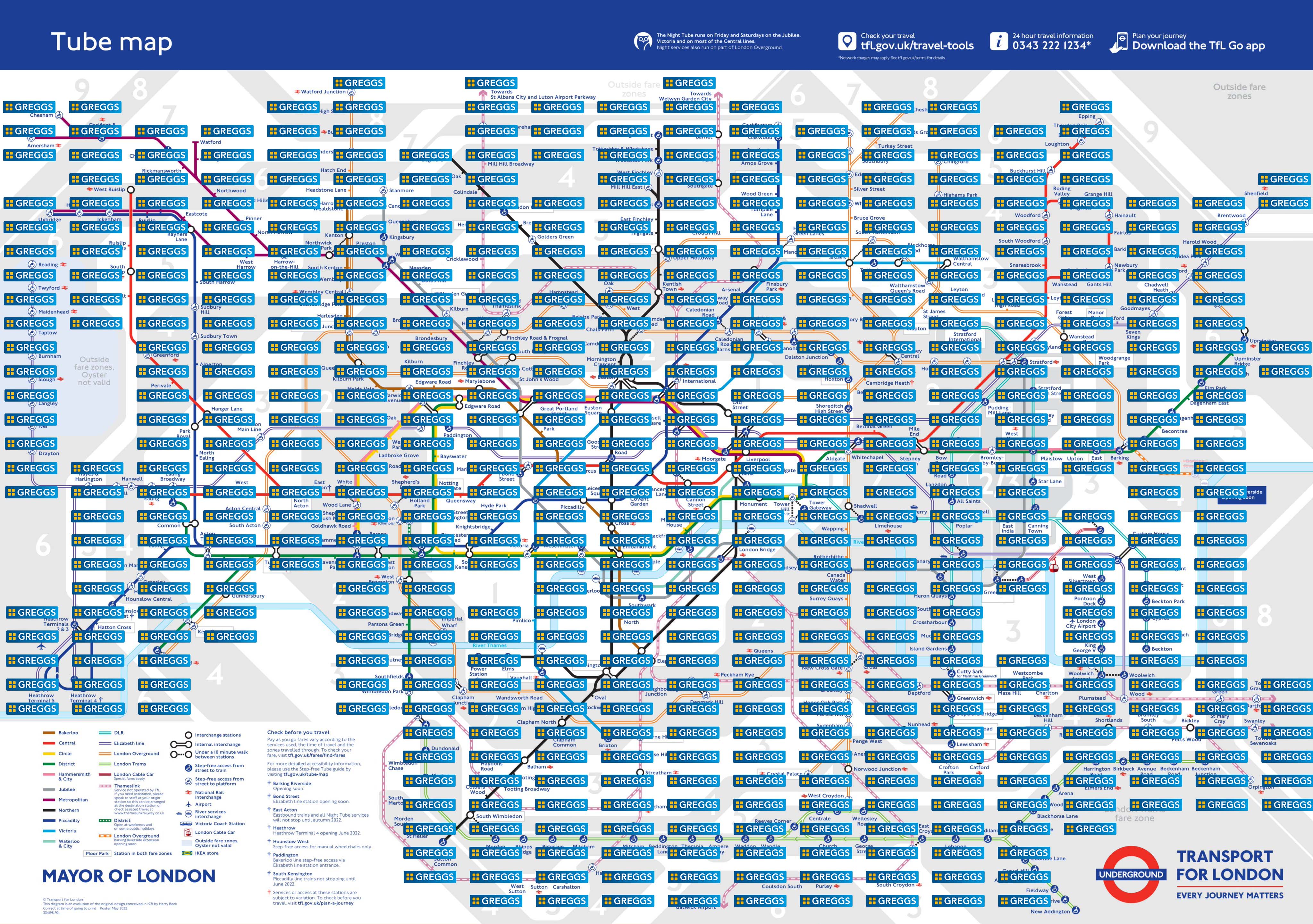
I’ll be blunt. I’m not a fan of the new map, and for one simple reason. Transport for London are doggedly clinging on to Beck’s iconic map, and continue to attempt to crowbar 18 separate lines/modes and 510 stations onto the map. It’s not just the additional infrastructure, but the additional demands by various stakeholders to include fare zones, accessible access detail, walkable elements, and now the location of IKEA stores due to a sponsorship arrangement. This isn’t Google Maps, yet TfL seem happy (or find it necessary) to seek sponsorship to fund the map and use it as an advertising hoarding. What next? A Gregg’s version? There’s more chance of someone eating a sausage roll on the tube than trying to get a Billy bookcase back from Neasden on the Jubilee Line. I’d contend the map is already an advert – of London. It’s recognisable and synonymous with the city. It’s just not particularly useful as a map any more.
How much did the Elizabeth line cost? Could not a small portion of the funds be used to help the designers do a proper redesign rather than just give them an impossible task by requiring the map to remain the same with the addition of more clutter.
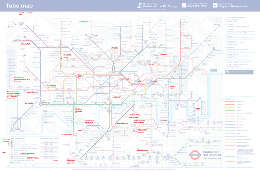
I’m not going to go through every issue I see with the map. A quick search will take you to plenty of sites, and commentators who explain how Acton Main Line station shouldn’t be shown north of North Acton, or why London Bridge appears so far away from Elephant and Castle when in fact it’s a short walk, or why there’s a huge bulge in the Thamselink line to cater for the Cannon Street label (e.g. here, here and here). Instead, I’m going to make a single appeal: dump the map. It’s no longer fit for purpose as a means to give people a clear, simple way to navigate London. Change it. Redraw it. Start over, and create a new map. It’s no longer a map of the ‘tube’. It’s a map of all the various interconnected transit systems in one of the world’s densest major cities with a fantastic public transport network. We need a new map to reflect the city. I’m not alone in this thought. We also need new ideas, and new principles to drive the process. Maybe new colours, and a new way to categorise the different lines (by mode for instance – deep tunnel, sub-surface, wide rail, light rail, tram etc). We need new ways to represent interchanges and a huge reduction in complexity. Let’s stop trying to stuff more into the gaps from previous maps, and have a new go, or even have a competition, and let people put their money where their mouth is. I had a go a few years back, and made an imperfect effort but I learnt a lot, and think I’m equipped to have another go.
In attempting to continue to honour Beck’s influence in the design history of London, TfL are doing the exact opposite, and ruining the legacy. The new map has, apparently, been completely redrawn but you don’t have to scratch too far below the surface to find the many minor errors and graphical glitches it contains. It might be easy to explain them if we were talking about a map someone made quickly, and threw at the internet but this is the damn tube map – one of THE most iconic maps and brands in the world, produced by a large and reputable organisation, and allegedly the result of an 18 month redraw. There’s so little scrutiny, and so little quality control it’s frightening. I did a quick editorial overlay but haven’t even got close to finding or noting all the issues I can see.
But the one glaring error on the new map (and many iterations in the last couple of decades) is inconsistency. A consistent design language is the cornerstone of any well designed graphical work. While TfL say they continue to apply Beck’s philosophy, the evidence says otherwise. Some lines are abutted, some are not, despite the same physical character. Some lines cut across others with a small margin, most do not. The font has been updated to Johnston 100 on the map, yet on the index on the reverse it’s still New Johnston. The once simple interchange symbol is now cumbersome (and too prominent) and connectors are overused, and seemingly an excuse for coming up with a better way of organising lines at major stations such as Liverpool Street, Kings Cross St Pancras, Euston, and Paddington. There’s so many unnecessary bends and curves to accommodate decisions made on previous versions, rather than working out how to properly modify, and integrate the old with the new. Some connectors are ridiculously long, even when the distance is short, and some are so small they’re hardly visible because the gap between station symbols is too small. And I’d go so far as to say that in some places the parallel black line interchange symbols look like a tube line themselves! The newly added walking distance lines showing where stations are less than 10 minutes apart have given rise to so many lines of different lengths that are non-linear in terms of reflecting walking times. Typography, alignment and justification is inconsistently applied. Boat services are sometimes on the river, and sometimes a an appended graphic to a station label. Accessibility symbols are unwieldy, and while noting step free access is useful couldn’t it be in the index of stations rather than on the map (it is -so it’s repeated information). I could go on and on…but as I was once taught, if a map requires you to consult the legend to work out what’s going on it’s failing in some respect. Even when you consult the legend this map still has the potential to confuse.
The old maxim of a good map having form and function is a little old fashioned but the new map has neither form nor function. It looks a mess. Its function as a mechanism to navigate easily has long been lost. If you see a pocket version of the map it’s practically illegible. Maybe the point is to force people toward apps and away from a printed map either for their pocket, or a station wall. Either way confusion abounds and it’s time for a new design for an old map.
Good job Kennth,
needless to say that I’m also not happy with the amount of bigger and smaller issues for the latest version. Personally I would identify two major problems. “Feature creep” and clinging too much e.g. to the alignment paradigm (or dogma?)
For sake of the discussion a nice example of an alternative Berlin transit map with quite a lot of documented underlying thoughts.
https://www.berlintransitmap.de/
TL;DR …keep it clean but also consider curves
One of my big issues is the now almost random way heavy rail lines are included. London Overground is on there because it’s a Tfl mode and Thameslink now appears to have made a permanent appearance when it was previously supposed to be a temporary addition.
Yet to give just one example any casual map user looking to go from Wimbledon to Waterloo wouldn’t know there was a direct train. This can and does cause real world confusion and wasted time.
It’s a hard problem to solve but the current system of including a line according to who operates it is probably the least useful categorisation for the majority of users. It’s not like it even reflects frequency as there are parts of the rail network that are more frequent than the tube.