There’s a large underground group of people who assert that the London Underground map is no longer fit for purpose and simply relies on its lauded history as a descendent of Harry Beck’s magnificent 1933 original. I’m one of those people. In 2019 I created a totally new design for the map (blogs here and here).
The map received many comments, some positive, some negative. I left it alone for a while.
In May 2022 the new Elizabeth Line was opened by the Queen who obviously held on long enough to open the line named after her. The official map received a major update. And the voices decrying it grew louder (including mine), so I’ve revisited my map to have another go, incorporating the new network additions. I presented the new map (actually, two maps) at the 2022 NACIS conference, a recording of which you can view here.
In this blog, I’ll show my new maps, designed to accommodate the results of a detailed cartographic editing process that assesses the form and function of the official map. Along the journey, we might consider the crucial question of whether holding on to an iconic brand, with all its flaws, is preferable to letting go of the past and designing a completely new map.
If you can’t wait for the reveal then you can view the maps here and here.
Let’s start with the original map by Harry Beck.
The original 1933 map is a cartographic icon and undeniably useful for navigation and wayfinding. Topological, reductive, and eschewed above-ground detail (other than the river), and used a minimalist symbol vocabulary with bright colours to distinguish different lines. It focussed on the following main design elements:
- Omission of detail
- Distortion of scale
- Schematicised
- Colour-coded to fit with a wider corporate design
- Straight lines – horizontal, vertical, 45° indicative of speed and efficiency of the network, as much as in the map’s design
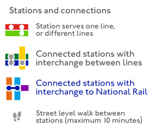
- Diamonds for interchange stations
It was a practical outcome as much as a perhaps unintentional but brilliant design statement. There were only 7 lines, and 212 stations. And here’s the map published in early 2022:
There are 11 tube lines, a light railway, 5 overground services, a tram network, and several rail services with over 480 stations. But it still retains the same basic principles that Beck brought to the map. In my view (and that of many others) it’s lost its way. It’s gone down the wrong track. It’s full of clutter. Apparently it went through an 18-month root and branch redesign, and according to Jon Hunter, Head Designer at Transport for London “The [new] map isn’t complicated. What would Beck have done? It would probably look like what we have done today.” I respectfully disagree.
Like previous editions new parts of the network are simply added. There’s little or no omission. No craft. No movement of elements to accommodate additions. There’s even more clutter and less space because TfL sold space to a major sponsor – and their logos now appear on the actual map as well as the banner at the bottom of the map. We’ve most definitely reached a junction
So I made a markup sheet of all that I (and others in their own assessments) identified as problematic:
The one glaring error on the new map is inconsistency. A consistent design language is the cornerstone of any well designed map. Some lines are abutted, some are not, despite the same physical character. Some lines cut across others with a small margin, most do not. The once simple interchange symbol is now cumbersome (and too prominent) and connectors are overused, particularly at heavily connected stations. So many unnecessary bends and curves are used to accommodate decisions made on previous versions. Some connectors are ridiculously long, even when the distance is short. Typography, alignment and justification is inconsistently applied. Even when you consult the legend this map still has the potential to confuse.
I literally tore my 2019 map apart, and spent three weeks rebuilding it taking account of feedback on the first version, plus my editorial review of the current official map. And this was the result with a better overall balance. Stations first, not lines:
You can view a zoomified version in its own window and download a copy of the PDF map here.
I removed the contrived diamond shaped routes from my 2019 version, and omitted extraneous detail that can be listed in the index of stations. It’s important to note that the reverse of the pocket map has an index of stations and information such as station facilities, accessibility, and fare zones can much more efficiently be shown there, and not on the map. I retained the actual River Thames so even though the map is schematic and not to scale, the inclusion of the river in its geographical form gives this map a different appearance than most.
I’ve used hierarchical typography, and colour coded by function and connectivity. There’s a simpler station and connector symbology to avoid the overbearing blobs on the official map. The current official tube map has 259 curves and 256 interchange symbols (yes, I counted them). Mine has 195 curves and 225 interchange symbols. So it’s precisely 19.5% more graphically efficient. That’s a spurious metric but it goes some way to emphasising how much neater I believe my version is compared to the official map.
But I noted I made two new version because I wanted to go further by taking the map down a different route altogether. The current official classification of lines is heavily based on historical organisation, and colours. But it’s potentially misleading because of the insistence on using a legacy classification which has been inconsistently applied.
Here’s a fairly standard depiction of the lines on the map, using the standard historical colours:
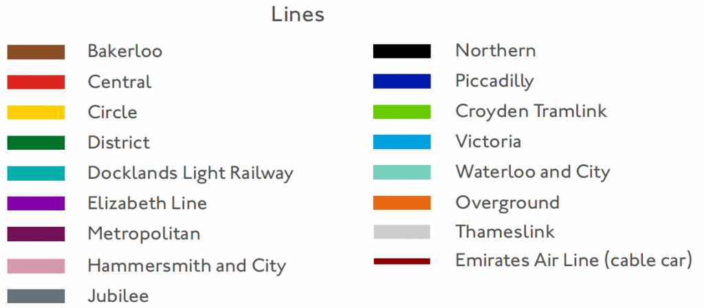
There are 17 different colours that no longer make sense to demarcate lines. But there are lots of different modes of travel because not everything is underground, or even a tube train. And there are even multiple routes even for what is currently shown as a single line. So what happens if we re-classify the lines by mode, and route? We might get something like this:
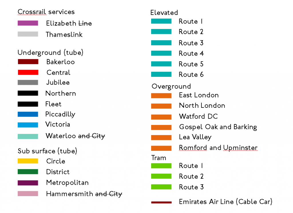
Even some of the naming conventions no longer make sense as the strikethrough text shows above. While mulling over how to reimagine a new schema, and colours, I saw Gareth Dennis had already come up with a pretty decent alternative so I decided to see how that played out on my design. So…here’s the new schema with, wait for it… NEW COLOURS:
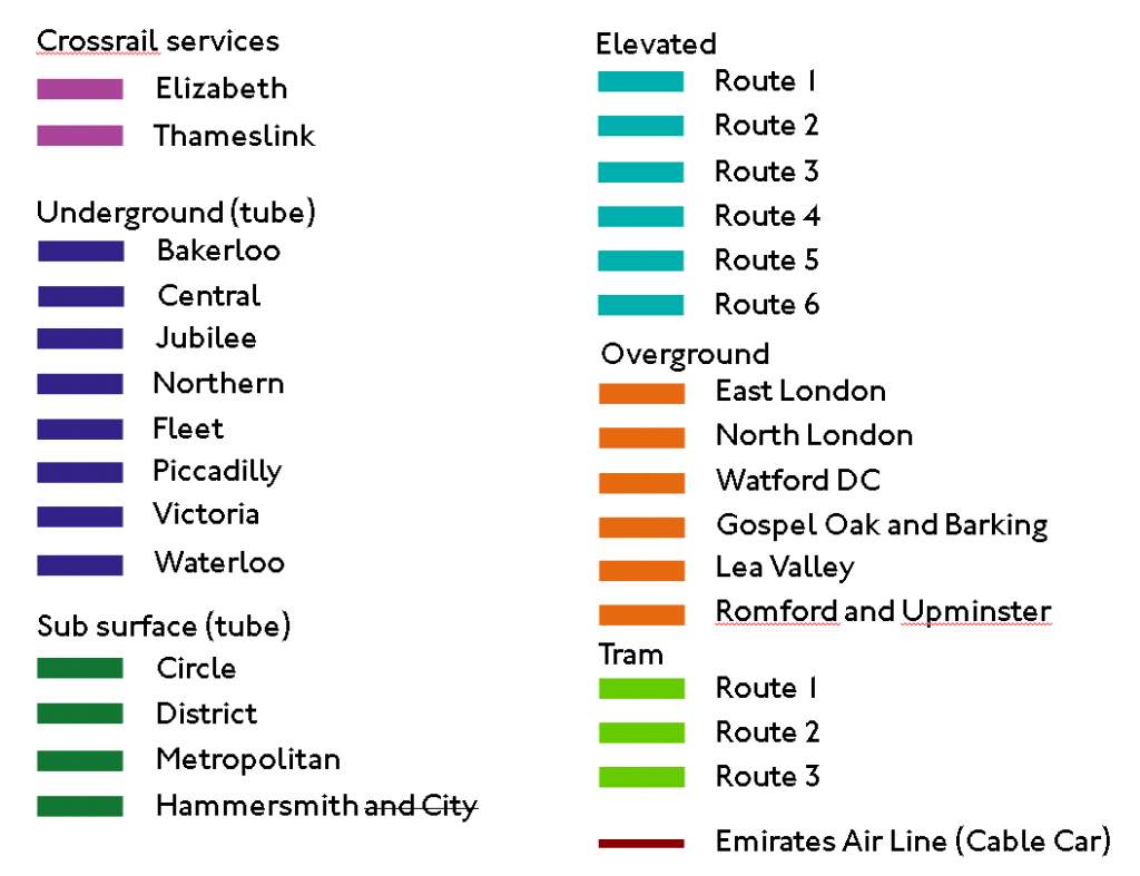
Sacrilege! Yet this new colour scheme is now accessible to folks with different colour vision. It’s consistent, and coherent, and suits 2022 much better than a graphical signage system devised nearly 100 years ago. Controversial yes, but we just have to recognise that the vastly different system needs a new look because the old one no longer fits.
This new schema also now means the map can incorporate additional, useful information that the current map does not, and cannot. Imagine standing on a platform and assuming that every train on a particular line starts and ends at the extremities of the line. They don’t. What? They don’t. There are multiple routes along and within each line, and that’s why you have to pay close attention to which train you get on to ensure it goes to where you need it to go, even though the map suggests it should because your destination station is on the same coloured line as your origin.
Route information can therefore be added to the map, particularly now there’s space having removed all the unnecessary clutter. Each mode has a unique colour (e.g. Underground is blue). Each of the lines has a designation (e.g. Bakerloo is T1), and each route gets its own route number so on the Bakerloo Underground line the Queen’s Park to Elephant and Castle route is designated Blue T1/3:
Because not every train operates the same even on the same line! So now, stations that act as a terminus for a specific route get additional colour-coded (by mode) text to note that designation, and along the lines there are indicators of what routes use that segment (again, colour coded to match the mode), making it easy to see what routes operate from the station you are at, and what routes you need to get to where you’re going.
So here’s the second version of my redesign which moves away from the traditional colours and includes this additional route information:
Again, you can explore a zoomified version in its own window and download a PDF of the map here.
In summary, I’ve made a new pair of maps using a new design language that (I believe) better suits today’s more congested network. I’ve made some contentious calls, particularly regarding the colours but it’s still recognisable as London, and there remains strong nods to Beck’s original. Whether you like my version, or one of numerous alternatives others have produced, any one of which is better than the current official map, it’s time for a new map.
And let’s not forget Harry Beck, in 1933 came up with a new design that was initially shunned, before it became a design classic so why not embrace a new map for London? More than anything, I think it’s important to challenge maps that no longer suit their original purpose, and creating alternatives helps inform a wider discussion.

PS. There’s bound to be errors. Please let me know if you find some! There’s also a couple of Easter Eggs so go hunting for those too.
River Thames is poorly drawn, Elizabeth line doesn’t pass through the North Greenwich peninsula.