Hello friends,
Here is my annual selection of favourite maps that I’ve seen this past year. They’re in no particular order, and I’ve most likely missed a load but here goes… and don’t forget to click on the links to go to the originals. I hope I’ve attributed maps correctly but if there’s any errors they’re mine and I’m happy to correct anything spotted.
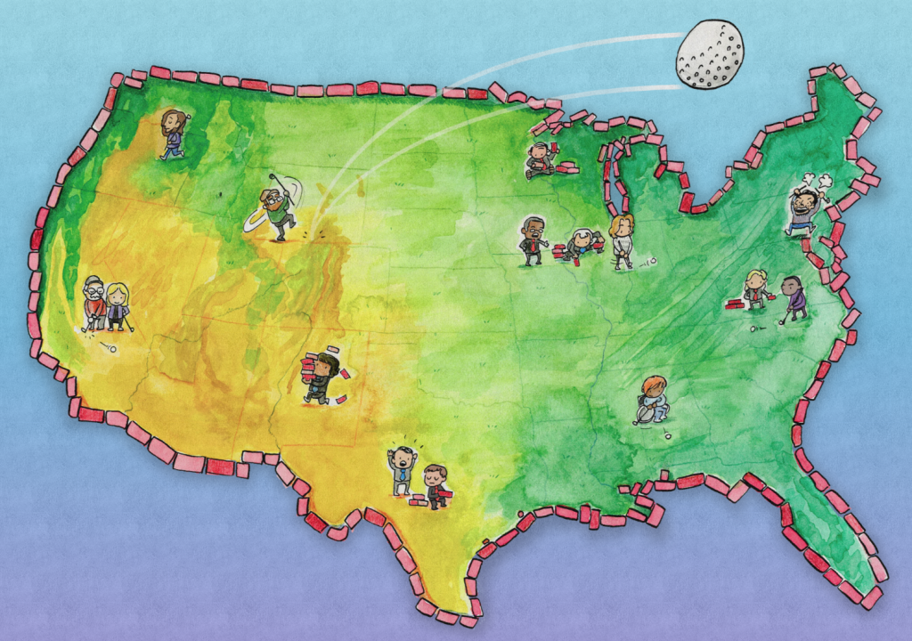
Play mini golf to see how politicians tilt elections using maps
By Dylan Moriarty and Joe Fox
Wonderful interactive game of golf for a range of US states to explore the issue of gerrymandering of US Congressional Districts. Beautifully imagined and executed. Something entirely different, and a really imaginative way of engaging the public in the issue at play. Play a round here Fore!
Western Monarch Butterfly Population Decline
By Dipika Kadaba
Animated symbology is hard to do well in cartography. All too often it can hide or hinder the message. But if the overall impression is the message, rather than the ability to accurately decipher or mine the data in the map, then it can be extremely impactful. This is a wonderful use of animated butterflies, as well as an animated timeline showing annual timeslices. The simplicity of the approach belies the technical achievement of creating an engaging animated map that simply works.
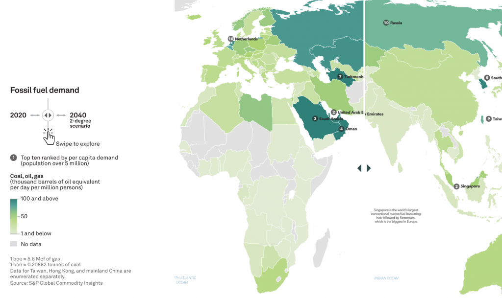
Atlas of Energy Transition
By Ginny Mason, Josephine Sajbel, S&P Global Commodity Insights
Timely, detailed exploration of global energy dynamics with dozens of well-crafted maps, charts, and graphs, many of which are interactive. What sets this set of digital maps apart from so many are the simple wins such as ensuring they’re using appropriate projections for each map type, and well-executed colour choices. View the online atlas here.
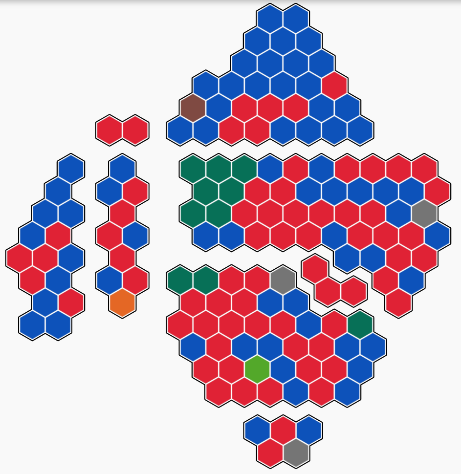
The Australian election map has been lying to you
By Colin Gourlay, Georgina Piper, Tim Leslie, Cristen Tilley and Matt Liddy
The Modifiable Areal Unit Problem is well known in geography. This fantastic description about map structure, and how it affects people’s ability to read and understand election results is great. It breaks down the problem of large areas with small population numbers, and small areas containing large population numbers into a scrollytelling story for general readership. Not to mention, building a new map to actually see Australian election results without being shrouded by large areas of uninhabited land. Because…hexagons! Full app here.
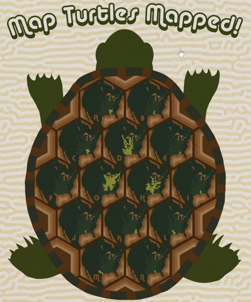
Map Turtles Mapped
By Aaron Koelker
The Map Turtle is a species of freshwater turtle that lives in North America. They are named as such due to the patterning on their shell that resembles a topographic map. So why not make a whimsically styled map of their habitat range. A fun way to visualise an otherwise pretty mundane dataset. View the full map here.
Ridgeline of the Sierra Nevada
By Joshua Flickinger
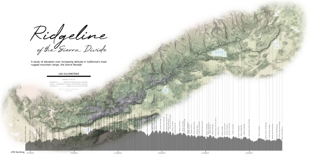
Cartography is seen by some as a profession where the only intent is to make maps pretty. It’s an irritating and derogatory misconception about what cartography entails. But why not make beautiful maps? Isn’t the trick to make a map that not only contains accurate, useful information, but to do so in an engaging way with expert design choices? The choices made in this map (colour, typography, content, layout etc.) coalesce into a beautiful portrait of the Sierra Nevada. The inclusion of the profile plot elevates it further (oh yes, that pun was very much intended!). View full map here.
Anatomy of the Lismore Disaster
By the Sydney Morning Herald
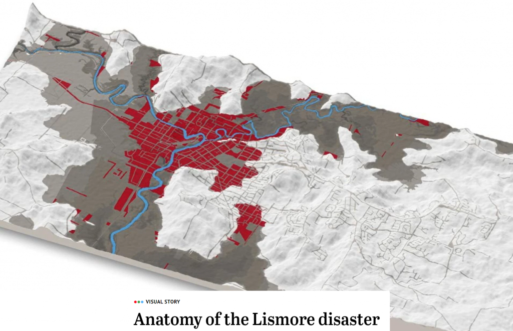
A state-of-the-art scrollytelling map and multimedia piece of journalism. Each map is elegantly made and incorporated into the story. There’s a mix of 3D block diagrams, planimetric animated maps, and immersive 3D dioramas, each contributing to the overall narrative. Done well, these pieces draw the reader in with a good balance of interaction but which doesn’t demand too much of the reader, or overawe the piece. View the app here.
Alaska: The Last Frontier
By Benchmark Maps
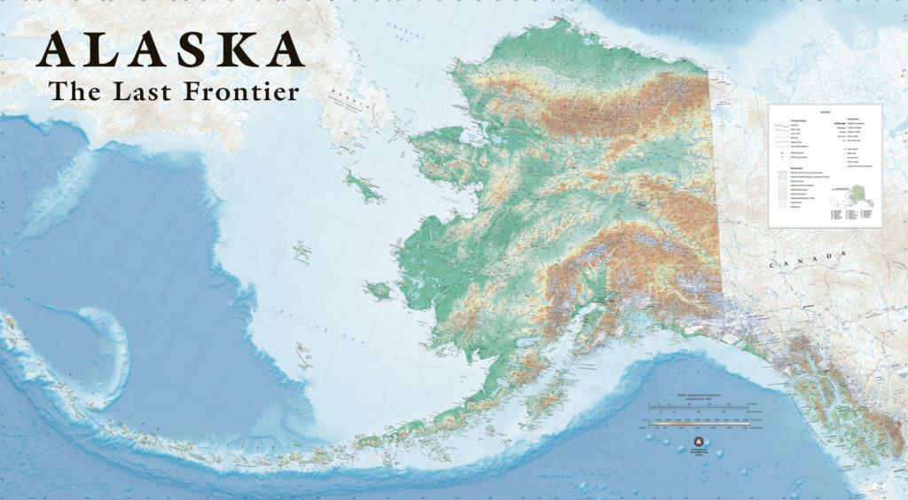
This map is ridiculous. It’s a wall map, but you’ll need a pretty big wall as it’s about 6ft high by 10ft wide. The title itself is about a foot high (not sure what point size that is!). But it’s not gratuitous like many large maps that just print big and leave content sparse. The detail of the content matches the size. It’s detailed. Even the areas that are sparse simply give the rest of the map space to breath. Exquisite colour choices and layout. Top Topographic mapping. View the map here.
Global Surface Temperature Anomolies
By Karim Douieb
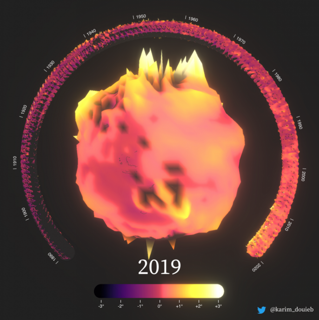
A really neat way to animate the changing nature of global temperature over time (go look at the original). As the globe turns, smaller globes break off and form the surrounding timeline as time moves on. It’s a novel approach to data we may have seen dozens of times before in more conventional ways. Look at the animated original here.
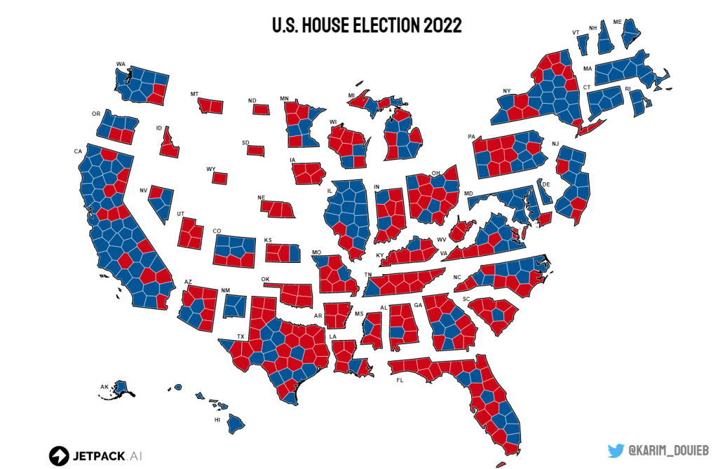
A better U.S. house election results map?
By Karim Douieb
A second map from Karim among my favourites from this year, who is doing some incredible work in the animated map space. Following on from the animated unique values to Dorling cartogram US election map Karim creates a version that morphs the geographical map into a cartogram where States are proportional to the number of Congressional Districts they contain. Districts are represented by approximately equal-sized voronoi polygons. So we get a cartogram that deals with the visual problems of unequal areas on a geographical map but with the benefit of the maintenance of geography to support recognition. Explore the methodology and animated morphing map here.
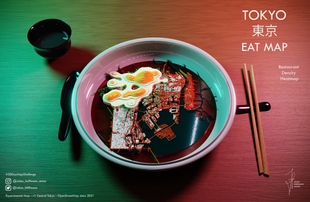
Tokyo Eat Map
By Julian Hoffman Anton
You could create a standard heat map of restaurant density in Tokyo, or you could make a bowl of delicious map ramen noodles topped with a couple of eggs that depict the density surface. And then top off the map with a complete table layout. I’d eat this. Tasty! Check out the original here.
The Andes Highway
By Joel Salazar
A poster exploring the route of the 14,150 kilometres of road that connect the Andes mountain range. I saw this poster in portrait originally but have since seen this landscape version that works even better. There’s nothing complicated about the map but the use of a solid colour background that complements the map content shows you don’t need to limit yourself to a white background. Orienting the map in a transverse aspect fits the subject matter too. Sadly I can’t find a hi-res version online but trust me, I’m a doctor, this map is a delight.

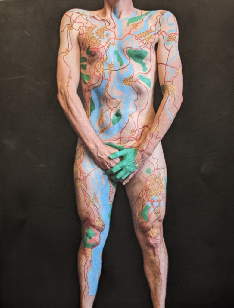
Human Terrain
By David Nuttall
David’s been creating these incredible one-off pieces of cartographic body art as part of his wider explorations in map art for some time. Check out his work, including human terrain here. In an era where we’re seemingly headed towards AI generated art (and, one wonders, when useful maps might be AI generated?) these very human pieces of work are simply stunning.
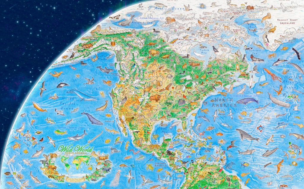
Wild World: North America
By Anton Thomas
The latest release from the pen of Anton, here’s the latest nugget from his Wild World opus. No need to wait for the whole world when you can delight in the many hundreds of intricaley detailed and colourful animals on this segment. It’s a fabulous piece of art. I’m looking forward to the completed world which Anton promises will be some time in 2023. Check out this map and more of his work here.
That’s my collection of maps that I found just a little more interesting than the many hundreds of others I’ve seen this year. As for my own work? 2022 was notable for the publication of my second book Thematic Mapping which I’m incredibly proud of.
I also designed a map of Ukrainian refugees that became an interesting exercise in collaborative, iterative design. I posted a draft of a map on Twitter, and over the next week or two I received a lot of feedback, and so re-designed the map several times to reach some sort of consensus, and what ended up being an innovative design. Here’s the final map which is meant to be empathetic to the subject matter, but also an arresting, perhaps unsettling, image of the movement of displaced people from war-ravaged Ukraine. But maps sometimes require symbology that emotes in specific ways. We should be disturbed by the situation. The map, I think, reinforces that feeling.

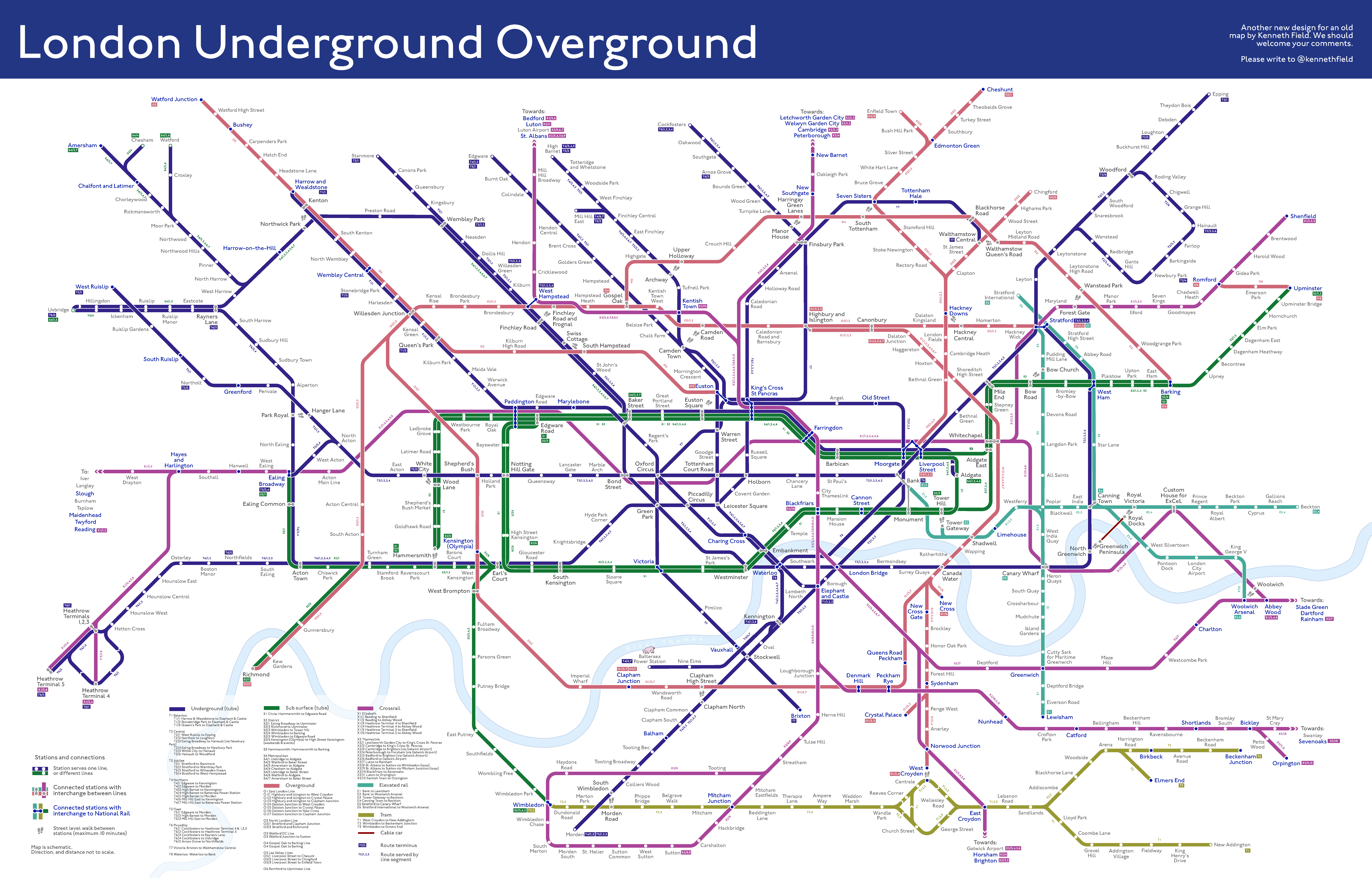
And I’ve continued my experiments in redesigning the London Underground ‘tube’ map because, well, it needs redesigning, as I and many others continue to argue. I’ve detailed my thought process, and design of this latest iteration here. But here’s the map.
That’s it for 2022. I wish you all a very Mappy Christmas and a healthy and fulfilling New Year.
